Patterns Of Distinction: Playing members of multiple factions
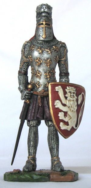
Image Credit: freeimages.com / gulden erikli tüllük
I don’t often get asked for help by another GM through the mailbox here at Campaign Mastery, mainly because the Ask-The-GMs service is suspended until I can get caught up.
Nevertheless, I received just such a request the other day, and I thought the questions good ones, so here goes!
Ronald wrote,
How can I make a difference between a faction/armed group/tribe? They all have [similar] beliefs, and can be easily confused.
In my campaign there is a group/tribe who call themselves “The Hunters”. They treat everyone out of their tribe as game, except for a few groups, mostly for benefit, fear or affinity.
There is no doubt [that] they have a cannibal ideology, based on “the strongest, the fittest” idea. [The campaign is] based in a post-apocalyptic world, and that [particular] Darwinian thought is widespread, and [certainly] not a unique trait of that tribe in particular.
There’s even a decayed sect based on Darwin’s idea of Evolution called the “Golden Society” who also practice cannibalism as well as a strong racial discrimination. Several groups share similar beliefs, [though they are] separate from each other.
[Which raises the general question,] in fantasy settings, how can the GM and players [distinguish] factions when they are very similar? And how can GMs effectively make a story without being repetitive in a campaign [where groups/factions have such] strong [similarity]?
— edited for clarity.
I’m going to deal with these two questions in separate articles, because they are very different in subject matter. The first one is about play, i.e. adventure execution, and the second is about adventure creation.
So, to the first question. In general terms, when the similarities between two or more factions outnumber and outweigh the differences, how can the GM – who has to play all the parts – make it clear to the players which faction they are currently representing?
Military Iconography
This is not a unique problem. It has been confronted on many occasions and in many different contexts. So let’s examine a few of them and see what we can learn, then apply that knowledge to the particular problem that we face.
One obvious parallel is with soldiers on a battlefield. If everyone’s in khaki, how do you know who’s a friend and who’s a foe?
Well, the cut of the uniforms is likely to be slightly different. Hats and other accessories are most likely to be individual to each army. But those can get lost or come off.
Weapons are also quite possibly distinctive, but that’s not very useful; not only would you have to get too close for such a means of identification, but in a combat furball, the likelihood that you might run out of ammo and grab an enemy’s weapon is just way too high.
Patches and insignia are going to be different. The nature and location of name-tags might be different, if any are displayed at all. These can be summarized as visual indicators.
Finally, and more to guard against infiltrators in false uniforms, recognition codes and passwords are reasonably common – with a reasonably quick rotation to a new one so that capture and interrogation won’t yield useful information to the enemy.
It’s no one thing – recognition is a compound of many different small distinctions. So that’s useful technique number one.
Sporting Iconography
Next, let’s think about sports. I have two analogies in mind – the first is ball sports, and the second is motorsports.
In both cases, it’s vitally important that you can distinguish one side from another at a glance. The solution is color. In both cases, teams use color to make themselves (and, where appropriate, their vehicles) distinctive.
Color combinations become iconic, a part of the team’s identification, symbolic of the team in some respect. I live in the Canterbury-Bankstown region of Sydney, and the local sports team in the dominant local football code has a royal blue and white color combination. If I wear anything in those colors, anywhere in the eastern coast of the country, that association would be instantly recognized. If I wore anything that matched another team’s iconic combination – for example, the Red and Green of South Sydney, or the Green and White of the Canberra Raiders, or the Red and White of St George, that too would be instantly recognized. Red and Black are a combination that I could get away with, because the team that used to have those colors – North Sydney – is gone from the competition and has been for twenty years or more. I have a sweat top which is red with gold flashes at the shoulders, which I can wear anywhere – because that combination isn’t used by any of the clubs in the sport.
But, if I were to wear it to certain parts of the US, it might be interpreted as support for the San Francisco 49ers, because those are their colors.
On top of that, each team generally has a logo or iconic image and accompanying name, again chosen to symbolize something about the club. The local team is the Bulldogs, symbolic of indomitable determination. South Sydney is the “Rabbitohs”, with a Rabbit icon, symbolic of speed. The Canberra Raiders have a Viking symbol. St George has a silhouetted Knight and a Dragon. North Sydney were the Bears. These images are totemic, and even if the colors don’t match correctly, still recognizable.
It’s the same thing with Soccer teams, and with Baseball teams, and Australian Rules teams, and Rugby Union teams, and Basketball teams, and Gridiron teams, and even cricket teams – in the shorter forms of the game, at least; remarkably, the traditional form of that game, test cricket, has everyone dressed in white, and you need to understand the rules of the game to interpret who is doing what and therefore what team they represent.
Both totemic symbols and iconic color schemes are recognition signals, designed to be recognizable at a glance.
Medieval Iconography
This isn’t all that new a concept, either; it derives from Heraldry, which had the purpose of providing a means of recognition of armies and commanders when faces were concealed by helmets. From heraldic devices spring the notion of national flags, which render certain color combinations and patterns iconic and instantly recognizable. When those combinations are likely to be misleading, a different combination is chosen which becomes just as iconic.

The American Flag, with it’s famous white stars on a field of blue and red-and-white stripes is instantly recognizable. In terms of instant recognition, it’s not even necessary for the number of stars and the number of stripes to be correct, so long as they are something close to correct. While an expert, or even someone paying close attention, will recognize not only that there is something wrong with the image of the flag shown here, and probably even work out what that something is, at a casual glance it is ‘close enough’ to trigger the association. Of course, the 50 stars in the real thing represent the 50 states, while the 13 stripes represent the original British Colonies, but most people don’t think that hard about the image. “Lots of stars, field of blue, lots of red-and-white stripes, it’s the American Flag” is about as far as a casual glance takes them.
And even if they recognized the errors – too many stripes, not enough stars – they don’t think of it as a different flag, they think of it as an American Flag that someone got wrong!
The Australian Flag has the Union Jack in one corner and a field of blue containing both the Southern Cross in white on the right and a seven-pointed star representing the Six States of Australia on the left, underneath the Union Jack. One point is reserved for Papua and any future territories, creating what is known as the Commonwealth Star.
The colors are exactly the same as those of both Great Britain (because their flag is the Union Jack) and the USA. On the sporting field, this would lead to all sorts of confusion – so Britain’s sporting colors tend to be red and white, or just white, and Australia uses Green and Gold, derived from the colors of the Boxing Kangaroo flag flown by Australia II in the America’s Cup.
Even beyond these applications, you see the same principles applied to corporate logos and corporate uniforms all over the world, though there are an awful lot more of these, so it’s usual that symbology and typography form an essential part of the corporate identification. The design of the Coca-cola logo is recognizable pretty much all over the world.
If there was a stronger means of distinguishing allied and opposing factions at a distance and at a glance, the sporting codes and business interests of the world would have found it by now. But the concept of iconographic representation in general is even more powerful, and definitely needs to be part of any solution to any similar problem.
Tribal Iconography
Let’s think about tribes for a while. To avoid offending anyone, let’s invent one: The Ashuni Tribe. The Ashuni Tribe want to distinguish themselves from all the other tribes around them, even though they eat the same food, drink the same water, have very similar social practices and religious beliefs. That’s because, a long time ago, the Ashuni and their neighbors were all one tribe, but a family was outcast for some reason, or separated from the main tribe, and slowly developed a slightly different cultural identity.
They could take their weaponry in a different and distinctive direction – but if the differences make them less effective or efficient in battle, they won’t last. Their language might evolve, but there’s sure to be a fairly large overlap.
The most likely thing to do would be to look to nature, and single out an animal that has a distinctive appearance, transferring that distinctiveness through clothing and fur and facepaint and even hairstyles. The Ashunti might adopt the Jaguar, or the leopard; or the lion; or the zebra, with its stripes, or an eagle and its feathers – nature is so varied in the appearances of the creatures that it creates that there is sure to be something whose symbolic territory isn’t already claimed by someone nearby.
Quite often, in fact, the choice in iconic symbology would predate the separation of the tribe, and be the iconographic representation of a key family – their ‘totem symbol’, in effect.
These symbolic representations would influence their development in other ways, as the symbology of the totem manifested itself within the culture. If a tribe chose a lion as their symbol, their totem, then the human values generally associated with that animal – popularly, courage – would become ideals to which they would aspire and values that they would cherish. Iconography should represent more than simply a symbolic association.
This is also a factor for us to bear in mind. The uniqueness of a point of cultural identification would derive from the natural surroundings, but would also propel other forms of distinctiveness and divergence. Let that persist long enough, and no matter how similar in every other way they might be to their neighbors, the differences would be like chalk and cheese.
I think we’re ready now to consider the ways in which these principles can be applied to the problem of making multiple factions in an RPG distinctive.
Techniques of RPG representation of Iconographic Cultural Identification
I have identified seven basic mechanisms by which one faction can be distinguished from another. Not all of them will be either available to, or suitable for, every GM in every situation, but I’ll deal with that as I discuss each of the six. The first principle that was developed in the analysis of similar problems remains – it’s usually not enough to have one point of distinctiveness, a compounded effect will be far stronger and more effective.
Verbal
Verbal distinctiveness can refer to differences as profound as an accent to a particular way of ‘mangling’ sentence structure, to the regular insertion of non-English words. It typically characterizes the distinctions between ethnic groups. It has limited utility in distinguishing between offshoots of the same ethnic population.
In other words, it’s great for making Dwarves different to Elves different to Humans, and even population groups as distinctive as national identities (France is different to England is different to Scotland) – but it’s not so useful for any case in which the differences are smaller.
Nevertheless, this aspect would be in force in at least one respect: no matter how similar their ideology, there would nevertheless be small but profound differences in the way each group describes the fundamentals of their beliefs. The bibles used by Catholics and Protestants are profoundly similar, but no two passages of more than one or two sentences are quite the same. Even broadly similar sections such as the Lord’s Prayer can have one or two words that are different, and that profoundly alter the meaning of the request being made through prayer.
This principle would definitely apply to the situation described by Ronald. In most cases, they would be saying the same thing, but saying it in different ways at times, and using slightly different phrases at other times. This is the sort of thing that would only be noticeable when directly comparing a more-or-less identical work, such as prayers or bibles or myths.
The greatest point of disparity is almost certain to relate to the subject or cause over which the separation between the two groups took place.
Vocal
Altering the sound of your voice is something that some people can do really well – and others barely at all. This goes beyond accents into questions of breathing and vocal register and intonation. Techniques can be simple, such as talking into your hand to muffle the voice, or profound, such as stretching the vocal cords and altering the resonances of the airways through tongue shape and position.
Try this for an exercise: Say aloud, “Well, you really should know that no two people ever sound quite alike,” a couple of times – and then say it while moving your tongue to touch your cheek instead of the roof of your mouth for d, t, and s sounds. At first, it will feel profoundly unnatural, but with practice, you will be able to do it. Here how the entire voice seems to change?
Then try this: recite the words “Dum, Dum, Dum, Dum,” over and over aloud, but instead of touching the front of the roof of the mouth with the tongue, gradually move the point of contact farther back into the mouth, and notice how the sound changes.
Most people are able to raise or lower their voice in pitch at least one step in either direction. Girls frequently use this technique to mimic a male voice and vice-versa, lowering and raising the pitches respectively.
On top of that, part of accents involves the tone of voice used at the end of sentences and questions. The difference in sound between “It makes a difference,” and “What difference does it make?” can be profound – so something as simple as phrasing statements as rhetorical questions or always phrasing questions as statements can make sufficient distinction between two different individuals. When those patterns are common to a larger group, you achieve a point of distinctiveness about the way that they speak.
A more extreme version involves identifying each faction with a particular well-known character with a distinctive vocal style that you then imitate whenever a representative of that faction is speaking. “These all speak like Darth Vader.” “These all speak like Tweety Bird.” “These all talk like Dirty Harry.” “These all talk like Ronald Reagan did.” I don’t recommend this technique because what most people deliver is a caricature of the voice that can be distracting and can undermine the seriousness of what is being said. But it’s something to keep up your sleeve!
Vocal techniques are great, but often not enough on their own. They may make a contribution to the distinctiveness but are rarely enough to do it all. So, let’s move on.
Behavioral
Italians are famous for employing gesticulation when they speak. What most people don’t realize is that people instinctively alter the manner and delivery of spoken words to fit the rhythm of these gestures, increasing the volume and slowing the pace of their speech at the end of each gesture, pausing briefly before the next stroke, and then speeding up at the start of the next gesture to try and ‘catch up’.
It follows that the use of particular gestures and gesticulations as a characteristic trait of a faction can also influence the vocal sound of that faction’s dialogue, even while it provides a visual indication. Consistency is the key – you can’t do it sometimes and not at other times.
It can take a bit of playing around to find a distinctive gestural ‘style’ for each faction, but it can be a useful technique when you aren’t a Mel Blanc, able to do that sort of thing naturally.
Beyond that, there are more subtle tricks that one can play. Contemplate the number of rhythm patterns that are possible using two fingers simply by varying the spacing between the beats. ‘One – two – one – two’; and ‘one – two – two – pause’ for example. Such finger-tapping probably won’t have a great impact on vocal delivery, but can form an audible subtext to the vocal being delivered to the players even when barely audible. However, a lot of people have trouble improvising dialogue while maintaining a cadence, even one simply tapped out with two fingers, so this is something that you will definitely need to practice in advance.
Soundscape
If in-game was reality, no conversation would take place in isolation; there would be a natural background soundtrack, sometimes described as a soundscape, that would vary slightly from one environment to another. I talked about the requirements, pitfalls, and potential solutions extensively in The Hollow Echo Part 1 – Adding Music To Your Game.
Scent
Another way the environment would figure in the real world is through variations in scent. In theory, it would be possible to precede each faction’s speech with a spray of an iconic perfume or scent; even something as simple as opening a bottle of scented oil and waving it around the table would impart a subtle cue. In practice, I don’t think this would work as well as such distinctions would appear in real life, simply because scents linger, and you couldn’t match the pace of scent dissipation with the compressed time involved in gaming.
Nor would it be possible to use realistically-representative odors (or desirable, for that matter). But I dismiss that particular problem because there are a wealth of possible scents that can be used symbolically to represent an iconic scent. Not that it matters while the first problem is insuperable.
Graphic
An obvious solution is to employ a ‘representative graphic image’. This could be a depiction of a typical representative of the faction, or it could be something more abstract, the equivalent of the iconic totem graphics used by sports teams. If necessary, even rudimentary graphical editing skills will suffice to create variations on the image.
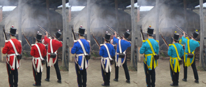
Image courtesy freeimages.com / Michelle Dennis, photo-manipulation by Mike.
Take a look at the image of the soldiers. The first image is the original. For the second, I simply selected all the red, deselected the odd bit of wood, ground, or skin that got picked up, then color-shifted the result. For the third, I did the same thing, but didn’t color-shift it quite as much, then selected all the white of the uniforms and used the techniques described in Stalking Fear: The Creepy in Non-creepy genres to colorize them yellow. It took longer to find and select the base image than it did to produce the two variations. Looking at them, could anyone doubt that they represented three completely different nations or factions?
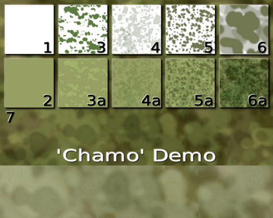
Sidebar: Chamo
Some people have a lot of trouble doing an effective “Chamo” pattern so I thought I would share this while I was in the vicinity of the subject.
Looks complicated, doesn’t it? It isn’t.
- 1. I started with a blank canvas.
- 2. …and made the whole thing a grayish green. This is my base color.
- 3. With a somewhat darker shade of the same color I did some blobs at random in a new layer.
- 3a. I set that layer to ‘add’ and gave it an opacity of about 45%, choosing that value by eye until it looked about right. When adding colors, the darker the color being added, the smaller the change it makes.
- 4. In a new layer above that one, I did some random blobs of a very pale and somewhat grayer version of the same color. If you look closely in the lower left corner, you can even see a few spots where I didn’t quite have the color right. I then turned that layer off until the next one was done.
- 4a. I set that layer to ‘multiply’ and again fiddled with the opacity until it looked about right.
- 5. More blobs in a darker shade of the same basic color, still grayer than the original color – compare this color with the one from 3.
- 5a. I also set this layer to multiply and fiddled with the opacity until it looked right. Then I turned the layer from 3-3a back on.
- 6. I then created a new layer directly above the base color and made some larger blobs in the same color, and then added some more at about 50% opacity.
- 6a. I also set this to ‘multiply’ and tweaked the opacity. The order of layers can be very important, because any layer on top of another modifies the image created by the lower layer. Also, anyone who knows anything about math will realize that multiple layers doing multiplication will compound to an exaggerated effect. That’s why there was very little impact on the base layer but some of the upper layers became much darker in color as a result of this layer’s inclusion. The result looks more like a forest than chamo pattern, but that’s just because I’ve shrunken these images down so that you can see them all at the same time.
- 7. The background to all these shows the image at the size that I actually created it. I merged all the layers and then applied a slight color shift toward yellow, because the greens had shifted slightly toward the blue.
Of course, if I wanted to apply this effect to clothing, I would need to make the color a lot more pale and somewhat less saturated, because ‘multiplication’ increases both those effects, so that’s what I did at the bottom.
To use this, I simply:
- Copy and paste the chamo texture into the photograph to which the texture is to be applied (into a new layer, of course), then hide it;
- select the parts of the photograph to be rendered in ‘chamo’ colors, and desaturate them so that they are in black and white;
- turn the texture layer back on and using the same selection shape, cut out what I need to cover the parts of the photograph to be transformed, getting rid of the rest;
- set the texture layer to multiply, fiddle with the opacity and fine-tune the brightness, contrast, and opacity until I get the effect I want.
What this ultimately achieves is that the color comes from the texture layer, while the shadows and form come from the underlying photograph – and only those parts of it that you want to change are affected.
It’s also worth noting that I spent only about ten minutes on this example texture; if I were doing one ‘for real’, I would have taken longer and a bit more care. This was a quick-and-dirty demonstration.
Also note that you can use this technique with any texture you find on the internet, though most will be too dark without modification. Fur, stripes, animal spots, lizard skin, even woodgrains.
Physically Illustrative
Here’s a simple idea: if you give each faction their own distinctive color combination, you can get a length of dowel maybe ten inches long, and use a combination of paint and glued ribbon to turn that dowel into a visual indicator that you simply hold in your hand to indicate which faction is currently “talking”. So long as you make the combinations sufficiently distinctive, players should be able to read the ‘cue’ with a glance. Learning which colors represent which faction might take a little longer.
If you implement this solution, all the others that you employ will help achieve that recognition more quickly.
Other Representations
Lots of GMs use miniatures. Even if you don’t use them with battlemaps, you can use them to solve this particular problem in various ways. And if you do, even occasionally, use minis for their intended purposes, you can consider this a ‘bonus’ application.
Bases
Instead of painting bases in realistic colors, such as was done in the main illustration accompanying this article, consider painting at least one figure’s base in the iconic colors of a faction.
If you have six figures, each identical save for the color of the base, it’s easy to hold up that figure to indicate who’s doing the talking.
Alternative Figures
Alternatively, you could use spare figures intended for a different game and take advantage of iconic implications. Let’s say that there are three factions: one numerous but weak, one anarchic and fiercely independent, and one oppressive and manipulative. Break out your Star Wars minis and use them to represent the different factions – not on the battlemap, but simply “in hand” as a visual prompt. Stormtrooper, Rebel, Darth Vader – done! This carries implied undercurrents of personality and relationship, which you can subvert or manipulate to your liking, because players will read things into these representations.
Similarly, you could use Lord Of The Rings figures to represent factions in a D&D or Star Wars game, or D&D figures to represent factions in a Sci-Fi game – you are limited only by the variety of your collection and your creativity.
Poker Chips
What if your figures are already beautifully painted, or of the D&D mini’s variety (some of which don’t have bases)? Place a poker chip under each figure, using different colors of chip for each faction. To signify that a member of one faction is speaking, simply hold up a poker chip of the appropriate color.
Of course, this precludes using colored poker chips for any other purpose, such as elevation.
If you want to get even more specific, you can get adhesive stickers of the “spot” or “dot” variety (often used for price tags), write a number on one, and use the numbered chips on the battlemap. That permits you to identify “blue 2” or “yellow 4” as the specific member of a given faction as the speaker.
Paint
If you are skilled enough, consider the expedient of painting ‘armbands’ (in iconic faction colors) onto some of your figures. This actually doesn’t require anywhere near as much skill as doing a full paint job, but you might still need to practice a time or two before working on an important figure.
Or, if they have bases, a couple of spots of paint might be enough – though this will be harder to see.
Colored rubber bands
Don’t want to permanently disfigure your minis? No problem. Get colored rubber bands and wrap one of a particular color around the base, arm, or foot of each member of a particular faction. Don’t wrap them too tightly and there will be no damage done at all.
Adhesive colored dots
Or you could apply those adhesive sticker dots directly to the underside of a figure.
More
I’m sure there are more solutions, but these should either solve the problem or point you in the direction of your own solution. Just remember the ‘rules’ that we derived earlier:
- Recognition is a compound of many different small distinctions;
- Totemic symbols and iconic color schemes are recognition signals, designed to be recognizable at a glance;
- Iconography should represent more than simply a symbolic association.
Turn these to your advantage and the recognition problem will be but a memory.

Discover more from Campaign Mastery
Subscribe to get the latest posts sent to your email.


March 9th, 2018 at 2:38 am
cheers for sharing, brilliant article – Calum Maxin
March 9th, 2018 at 2:37 pm
My pleasure, Calum, and thanks for taking the time to comment :)