Perspectives Of Plot
There are parallels between Perspective, as used by artists, and how players and PCs will perceive plotlines in an RPG Campaign.

Image by Danny Choo, CC BY-SA 2.0 , posted to Flikr Feb 4 2011, retrieved via Wikimedia Commons. Resized and Contrast slightly enhanced by Mike.
Wow, but this turned out to be bigger than I expected. I expected to be able to post it Monday, instead it’s going up today – early Sunday morning in my neck of the woods. But hopefully it’s worth the wait.
Perspective
The use of perspective is one of the oldest tricks in art. While a formalized use of perspective wasn’t introduced until 1415, the ancient Greeks and Romans were emplyi9ng it instinctively to simulate depth in a flat image.
Perspective works because our brains learn to associate certain phenomena with distance, and then interprets the introduction of those phenomena onto the art page as ‘some things are further away’, creating the appearance of a depth of field.
It’s just one step removed from optical illusions, if that, and that is a rabbit-hole down which many an hour can be poured. Today’s article will deny that temptation for as long as humanly possible, because there’s a completely different aspect of artistic perspective onto which I want to shine a spotlight.
The basic premise of perspective is something so simple, everyone should understand it instantly: things look smaller the further away they are.
That’s it. Everything else is a refinement of that principle: focal length means that only one distance is in perfect focus, everything else is blurred, except when that’s not true; saturation means that the further away things are, the lighter in color they appear to be (except when it’s the other way around); shadows connect objects with their environment (or disconnect them from the same).
It’s easy to see why perspective holds the number one slot, with caveats and exceptions and complications galore with all of those other artistic rules of thumb.
Hollywood has been playing games with perspective since loving film has been a thing, pretty much. Models that look as real as actual construction – except when they don’t get something right and it’s obvious that it’s a model. Forced perspective to make buildings look taller (or even simply there); even the Forced Perspective trickery of The Lord Of The Rings that was used to make Frodo and co look tiny relative to Gandalf.
Once again, the ease with which our visual perceptions can be deceived beckons us down the optical illusions rabbit-hole. But I am made of sterner stuff, and again, I pass the test.
This article is going to look at some foundational principles of perspective, without necessarily explaining how or why all of them work, because I have noticed that they make wonderful metaphors for aspects of storytelling, especially in RPGs. Again, you don’t have to really understand why they work in that respect; the perceptions of the viewer do the heavy lifting for you. But – and here’s the really important bit – you can use these tricks deliberately to create false impressions regarding plot elements just as visual tricks can be used to deceive us when we look at an image.
Let’s get started….
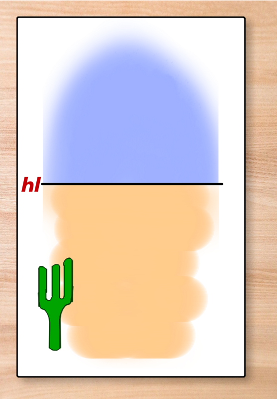
The Horizon Line
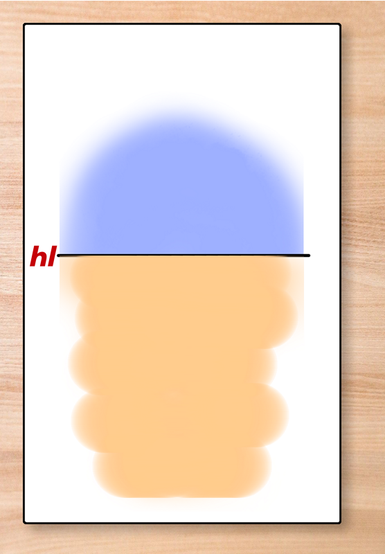
The image above depicts a simple earth-and-sky image. The line where the two meet are the horizon, and so that line is called the horizon line.
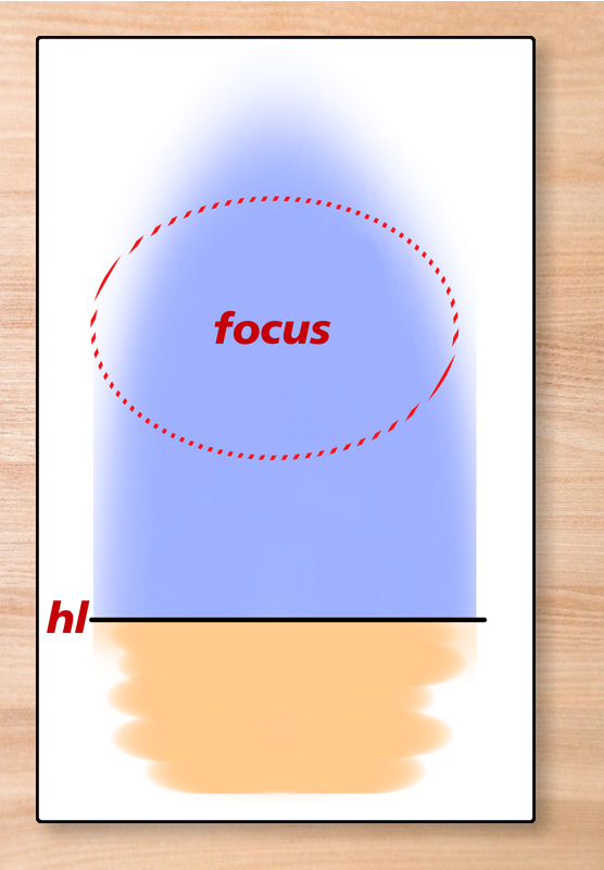
One of the first tools that you learn to employ as an artist is the placement of the horizon line, and what it causes the eye to focus on. If the horizon line is placed high, as in the image below, then the central focus is the immediate foreground, with everything else serving as a backdrop.

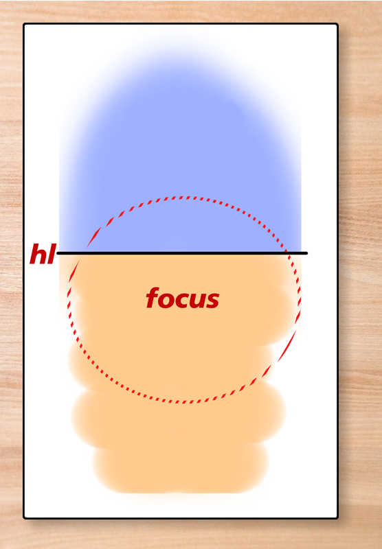
If the Horizon Line is low, then the focus is on the sky, and on distance, as shown below.
All sorts of intermediate values are possible. I’m not going to get into things like tilting the horizon line (which suggests movement of the observer), as it’s not relevant to this discussion – I just thought I’d mention it. For this study, I’m going to place the horizon line close to, but a little above, the middle, so the focus will be on the mid-ground. “Perfect” placement would be about 2/3 of the way up, but that can actually feel artificial; a little deliberate imperfection can be valuable in creating a sense of realism.
Sidebar: Why the frames, when screen real estate is limited?
There are two reasons why I decided to put frames around the images. Neither is justification enough on its own, but the combination was hard to refuse.
First, it makes the panels look more like pages, and that has a psychological effect of connecting each image with its successor, as though both were happening on a single sheet of paper.
And second, the frame creates a greater separation between images, making it easier to focus on the content of each without being quite as distracted by the one before it, even when both are visible on the screen at the same time.
Those purposes, at first glance, appear to be mutually contradictory, but both are true at the same time. The frame carries an implied continuity even while placing greater physical separation between the content.
While I’m here – you may also notice that the pages within the frames are slightly offset from dead center. If they were dead center, the content feels more artificial – offsetting it to the left and top by a bit gives a subtle ‘hand-drawn’ quality that I thought was useful in this context. And it also makes a little more room for the drop shadow underneath the ‘pages’, creating greater cohesion within each image overall.
Just a couple of design tricks that I thought I’d bring to your attention.
Introduction To Perspective
Lets throw in a cactus to illustrate the fundamental concept of Perspective: the brain equates “smaller” with “more distant”.
So here is a very small, distant, cactus:

And here’s a middle distance cactus:
And here’s one really close-up:
I didn’t make any effort with the three cacti to scale them perfectly – I just scaled them by eye and went “Close enough” when satisfied. If the middle one is ‘too big’ that doesn’t matter because you expect organic things to be different sizes.
What works for organic growths like plants doesn’t work so well for regular, man-made things. For those, we need a little geometry and the horizon line, and a vanishing point.
The Vanishing Point
So let’s talk about the vanishing point. You can have 1, 2, or 3 of these. One focuses everything on a single point, two is how you deal with objects that are rotated horizontally relative to your position, and three introduces a vertical perspective. We’re not interested in most of that for today’s purposes, so I will be working with 1 vanishing-point perspective.
On the image below, I’ve drawn two angled lines running toward the horizon. Where they meet the horizon is the vanishing point, because that’s where the lines vanish..
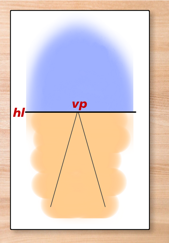
The human mind interprets these as straight, parallel, lines until proven otherwise, because the separation between them gets smaller as they approach the horizon line, and smaller means further away.
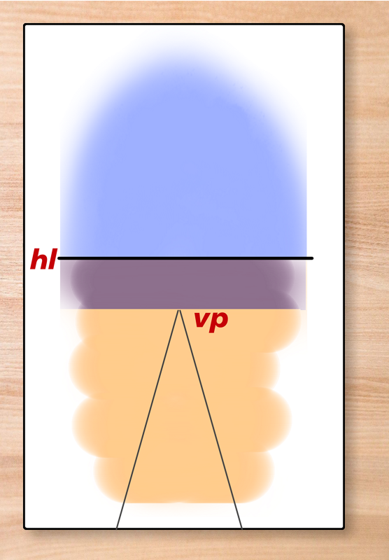
I can also place the vanishing point above the horizon, like so:

The vanishing point – the power of perspective – is so strong that when this is done, it doesn’t shift the perception of the lines, it brings the horizon closer and implies some intervening terrain. The Horizon line must have hills that are concealing the more distant part of the lines, or the lines dip down into a valley, or something. If you were to gradually bend the lines inwards and then outwards in the middle, so that the ‘distant end’ remained parallel with the lines as shown, it would even more strongly imply terrain, because the brain still sees them as straight lines, even when they aren’t any more.
What happens, then, if I make the vanishing point below the horizon line?
The vanishing point is so powerful that the mind insists that the gap represents objects over the horizon, like distant mountains, and moves the horizon line. Like this:

…and in doing so, it shifts the focal area toward the sky, and – in this case – toward where the ‘mountains’ are.
Railroad Tracks
With that demonstration of the power of the vanishing point, and hence of perspective, let’s go back to what we had before I started moving vanishing points up and down, and draw two horizontal lines between the angled lines. Actually, the important thing isn’t that they are horizontal, it’s that they are parallel to the horizon line.

If I were drawing this on paper, I’d have to use erasable guide-lines and measurements, but since I’m doing things digitally, i can put my work in another layer, then hide it at my convenience.
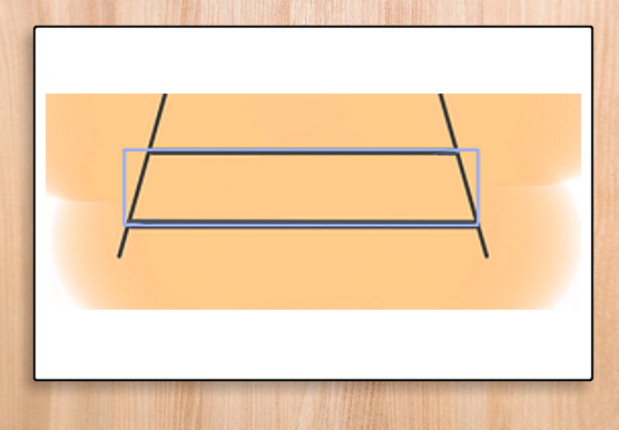
So, what I’ve done is draw a box, width the same as the lower line, height the separation to the upper line:
If I use that box to mark out equal divisions along the path toward the horizon, then this is what I get:
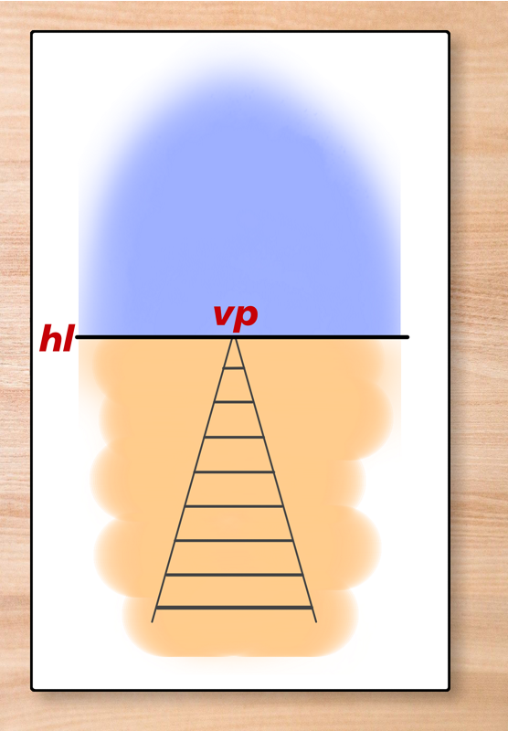
It doesn’t look right. The division lines are suggesting that the separations are getting bigger, not staying the same, because things get smaller as they get further away. These divisions are fighting the power of perspective, and the results are a visually-confusing mess.
So here’s the right way to do it: From one of the lower corners of the box, I draw a straight line NOT to the opposite corner, but to the intersection point between the opposite angled line and the horizontal line:

I then move that guide-line box so that it’s bottom lies on top of the second line, with it’s lower left over the left-hand angled line. I then look for where the angled guide-line intersects with the right-hand angled line…

…and THAT is the point where the next division line should be, like so:
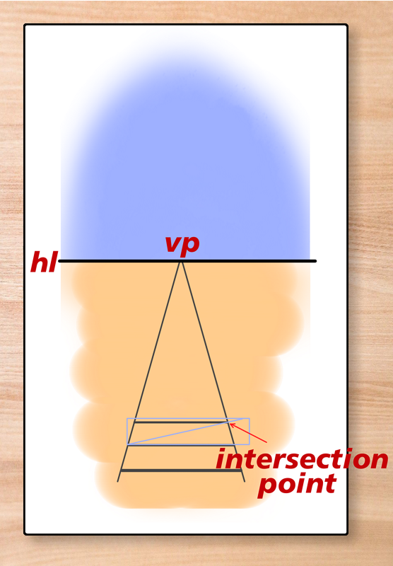
I repeat that process to get a fourth division line:

And then a fifth, a sixth, and so on, until I get this:

That is what divisions of equal length look like when they recede into the distance. This looks right.
It works because the angled lines of all the boxes are parallel to each other, which means that they cross the angled lines that recede to the horizon at proportionately shorter distances each time. If this had been a pencil-and-paper sketch, that would be immediately obvious; since it’s not, I’ve had to explain it. And notice that the bottom left corner tracks the other line angled toward the vanishing point, too, that’s part of the trick, because that defines the origin point of the angled line within the box, so that the intersection points are correct..
[Actually, I cheated just a little – the lines themselves get slowly smaller as they recede, reinforcing the impression through the power of smaller = distant.]
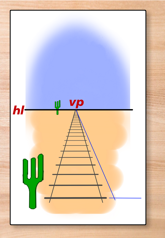
Right now, this could be a depiction of a scale marked onto the ground, for all we know. If we want to make a railroad track, then these horizontal lines should represent sleepers, and everyone knows that sleepers extend beyond the width of the track.
But the amount should get smaller in the distance, because smaller = farther away. So, in the image below, I’ve drawn in two additional guidelines, both running to the vanishing point:

…and then I’ve used one of the magical transformation options that I have digitally to extend the horizontal lines to ‘fit’ those guide-lines:

I did that in some haste, trying to get all these illustrations done in a single session, and the observant may notice that I have inadvertently introduced a slight ‘droop’ to the sleepers – they are no longer perfectly parallel to the horizon. The difference is small, but – to my artist’s eye – quite noticeable. But I fixed it in subsequent images.
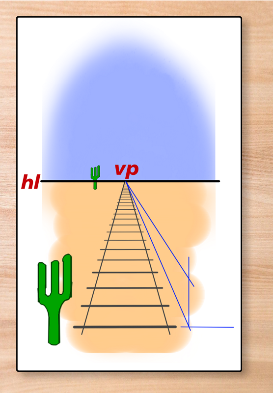
Bigger vs Smaller
I can further reinforce the effect by restoring two of my cacti – the two most extreme ones:

And right away, because smaller = more distant, you can see that the larger cactus looks to br right next to the railroad tracks, while the smaller one looks a lot further away from them.
Because this is an important point to reinforce, let’s construct some boxes beside the tracks.
Start with a guide-line running to the vanishing point:

Second, I add a line parallel to the horizon to form the near corner of the box:
From that corner point, I draw a vertical line:

…and a second line crossing that vertical and running to the vanishing point starts to define the side-wall of the box.
But this also gives me all the information that I need to establish the front wall, so let’s do that:

And with the far corner of the front of the box now determined, a third guide-line from the vanishing point starts to define the top of the box:

The final thing we need to do to define the box completely is to decide how deep it goes. I decided that a bit less than 3 sleepers was the correct amount. From the bottom of the box (intersection point 3), I drew another vertical guide-line until it reached intersection point 2; and from the point, I drew a line parallel to the horizon to intersection Point 1:
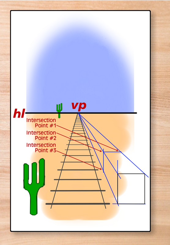
That let me completely define the size, shape, and orientation of the box:
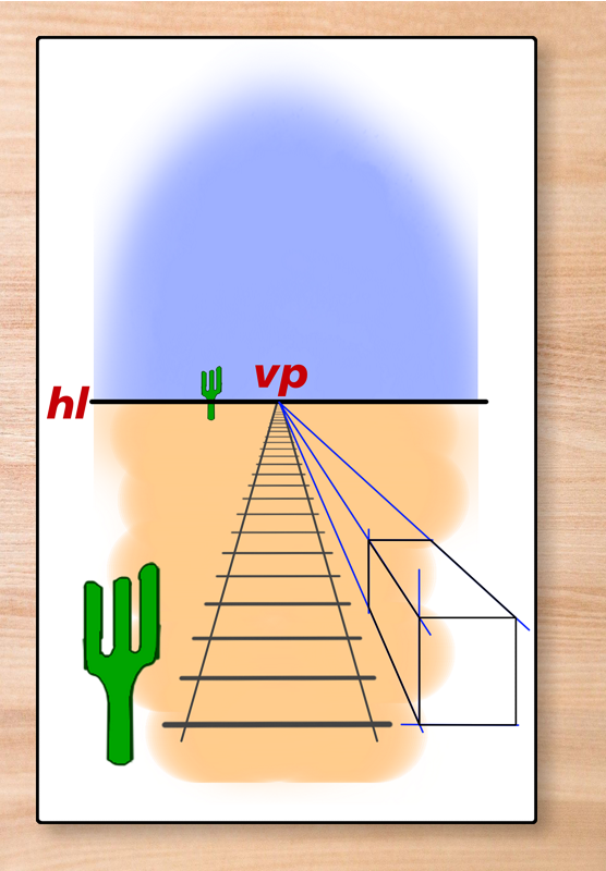
I filled the box sides with white:
And then shaded it to create a 3D perspective shape.

In the image above, I’ve almost completely removed the guide-lines, keeping them just visible enough to make the relationship between box and vanishing point clear.
Using Distant Equals Smaller
There’s one other attribute of the horizon line that I should explain before continuing: It matches the eye-line of the ‘viewer’. If the viewer were to suddenly grow two inches, it would shift both horizon line and vanishing point downwards a small amount, so that the character was more looking down on the scene. It would move in the opposite direction if he were to look up at things.
This means that the correct position for any person whose eyes are an equal height off the ground is for those eyes to be on the horizon line. If they are above it, implies that either the ground they are standing on is elevated, or that they are taller than the person observing the scene – and if below, they are probably shorter than the character whose perspective is being depicted.
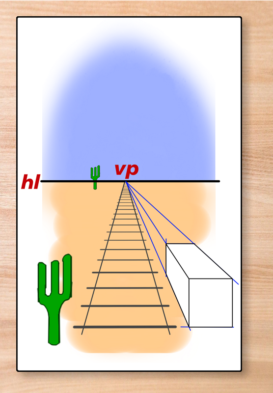
Anyway, moving on. In the image below, I have positioned two more boxes, each smaller than the first one. The second one has been mirrored and placed on the other side of the tracks, while the third one is the same distance from the right-hand track as the first.
Neither of these added boxes is quite right. This is not an accident onmy part.
The middle box has a correct right-hand side relative to the railway line, more or less, but the far side, if you project a line along that side, ends up nowhere near the vanishing point. But the vanishing point is so strong that this can be disregarded by the observer. Nevertheless, the implication is that the far end of this box is bigger than the near end.
The third box has the same problem, but by projecting above the horizon line. it subverts it within the brain. If the first box was not there, the third box would not look or feel real, but because it seems so parallel to the tracks and in-line with the first box at the near end, the brain insists that it not only is real, but is actually much larger than depicted.
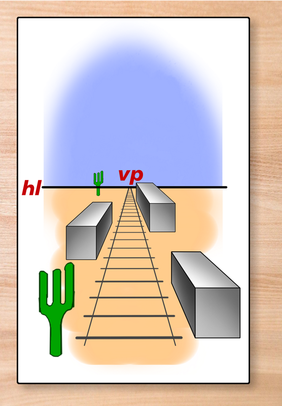
There’s one more subtle touch that most people won’t have noticed until I point it out with this image:
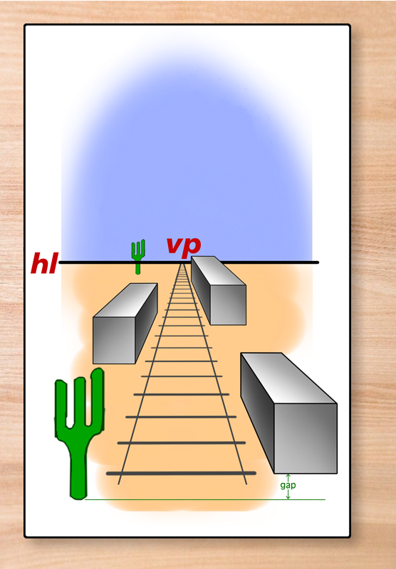
I have deliberately placed the foot of the near cactus below the front of the first box. The resulting gap or ‘offset’ adds significantly to the credibility of the image. It creates additional depth of field. If it were perfectly aligned, the image would look less real. This is a valuable trick to remember – if you are depicting a town intersection, as from a rooftop or window, put a car or something on the street in front of one of the buildings, and the buildings will immediately feel more three-dimensional.
Let’s grasp the scale
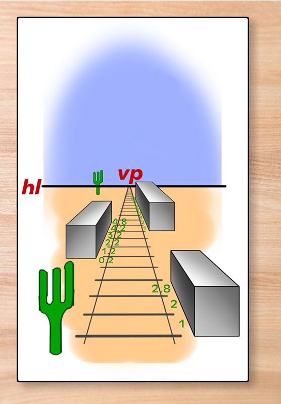
I set the near box as being 2.8 sleepers long. If I count up the number of sleepers length of the second box, it comes to 4.8 sleepers long – and that means that it is being depicted as 48 / 2.8 = 1.7 times as high and 1.7 times as wide as the first box.
I also counted up the sleepers scale for the third box, but realized that it was very hard to read, so here’s an enlargement:
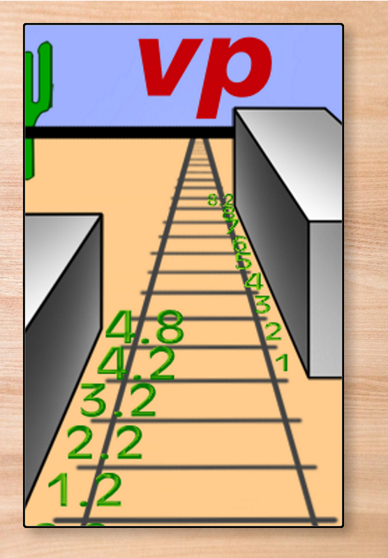
Even that’s a little hard to make out, but the total was estimated at 8.2 sleepers in length, again about 1.7 times larger than the second box.
By volume, the middle box is 1.7 x 1.7 x 1.7 = 4.913 the size of the forward one, while the rear one is about 24 times the size of the front one.
So, if the first one is the size of a small room – as in a stagecoach – then the middle one is about the size of a medium-large flatbed truck, and the back box is about the size of a very large room, or a structure containing several rooms. Which is kind of the point.
This enlargement also reveals a deliberate error that I don’t think anyone will have really noticed until now – the small cactus has been placed behing the horizon line ever since it was re-introduced to the image.
One Final Point
I’ve discussed the power of perspective a number of times already. But I wanted to point out how the errors in perspective for the two more distant boxes don’t leap out at you unless you look closely at them – and even then, the mind tries to assemble a unified picture, adding semantic content to the images to explain the discrepancy. The errors don’t break the perspective – they add imaginary information to the ‘rogue elements’ that explain the discrepancies. That’s the way optical illusions work.
Application To Plots
For the purposes of this article, I’m going to subdivide a campaign into adventures, which have a defined central theme with a beginning, middle and end.
I’m also dividing campaigns into plot arcs or plot threads, each of which will eventually form the centerpiece of an adventure. These can start at any point in the campaign and build up in the background as incidental scenes within an adventure aimed not at that adventure but at the longer-term. Much of this will be foreshadowing, but some of it can constitute snippets of “beginning” and even “middle”.
A third layer deals with alternatives and contingencies based on player agency and inputs. While most of the preceding layers can encompass internal variations leading to the same plot developments and essentially the same adventure, every plot arc and adventure contains critical moments with assumptions that the players can invalidate, where the players can change the course of the adventure, or bring resolution of a plot arc forward, usually at the expense of some other course of action that the GM’s plans have anticipated.
Beneath that layer, a campaign consists of events. Most of these are encounters of some sort, resolvable through roleplay. skill checks, combat, or some other action choice. Most encounters will relate directly to the development and resolution of the current adventure, but some in the middle, and especially in the beginning, may derive from other plot threads that are being mentioned or developed or shaping the campaign background. There will also be scenes/events deriving directly from player choices.
Here’s a graphic representation of this campaign structure:
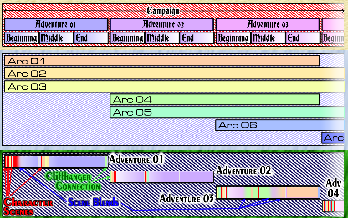
Click on the above to open a larger (clearer) version in a new tab.
This depicts a campaign of 4+ adventures, each with a beginning, a middle, and an end. There are three plot arcs that start in Adventure 01, with Arc 01 ending in Adventure 03 and the other two continuing beyond that point. There are two more plot arcs that start in Adventure 02, and Arc 04 also concludes in Adventure 03. Adventure 03 also sees the start of Arc 06, and Adventure 04 kicks off Arc 04.
Note the color-coding of both adventures and Plot Arcs. This isn’t just making the charts colorful, it’s to make the contents distinct in the third layer.
It’s the third layer that is most complicated, and I wouldn’t actually “map” it this way for usage. This shows the presence of scenes from the plot arcs within each adventure, and if you look closely, there are divisions breaking the adventures up into beginning, middle, and end.
Adventure 01 starts with a character scene, then has the beginning of Arc 01, another character scene, the beginning of Arc 02, a third character scene, a second scene from Arc 02, a fifth character scene,
the beginning of Arc 03, and then a character scene that blends into the main adventure. In the middle section of this adventure, attention is diverted away from the main plot to have a character scene, a plot development in Arc 01, and a plot development in Arc 02. That tells you something about the main plot having a relatively slow burn at the start of the middle, it’s probably a placeholder to get the campaign established. The end of Adventure 01 is entirely focused on the main plot of the adventure, which is fairly commonly the case – but there can be exceptions. The adventure ends with a cliffhanger connection, a prelude to Arc 04.
If I were putting this together for use, I would already have an outline of each scene from the plot arcs and the adventure anatomy would be a list of events in sequence, not a strip of colors.
Adventure 02 is far more self-contained. It’s beginning starts by resolving or mentioning the cliffhanger, has another step from Arc 01, a character scene, a step forward in Arc 02, a second character scene, and then the main plot of the Adventure. The middle has a character scene, a development in Arc 01, and the beginning of Arc 05. The rest of the adventure completely focuses on the main plot of the adventure.
Adventure 03 is more ambitious. The beginning starts with a development in Arc 03, followed by a development in Arc 04, a character scene, a development in Arc 01, a development in Arc 02, a character scene, a development in Arc 04, a character scene, and then the main adventure kicks off – but part way through the beginning, that adventure blends into Plot Arc 04. The Middle of Adventure 03 starts with a development in Plot Arc 01, returns to Plot Arc 04, interrupts it for a character scene, and plot arc 04 then blends back into the main plot of Adventure 03 before unexpectedly blending into Plot Arc 01. There is no further mention of Plot Arc 04, so it has to have been resolved in that blending back into the main adventure. The end of Adventure 03 focuses almost completely on resolving Plot Arc 01, but there’s a tiny bit of Plot Arc 06 at the very end to get that development underway. It’s highly likely that this will explore repercussions from one or both of the arcs that concluded in the adventure, and that the main plot gave the PCs a tool that could be used to resolve plot Arc 04.
The analysis has skipped over definitions of four terms, which it has used throughout – so let’s momentarily backtrack and define them.
A Development in a Plot Arc is just a scene from that plot arc that advances that particular storyline.
A Character Scene is an opportunity for a specific character to be roleplayed with no lasting repercussions for the time being – unless it is also a Scene Blend. Note that most Plot Arc developments will be character scenes that DO have a lasting impact on the plot. Character scenes and Plot Arc developments are often used to establish who’s where and doing what at the start of an adventure, and are often oriented around player requests / goals for a specific PC.
A Scene Blend is where one plot sequence interacts or merges with either the main plot, serving as a springboard back into that main plot; or it’s a Plot Arc interacting with the Main plotline of the adventure, or vice-versa.
And a cliffhanger connection is when an adventure ends with a prelude or preview to the next adventure; it’s as likely as not to tease information to the players that their characters don’t get, and it often serves to make plot arcs seem more menacing or imminent.
Alternative Campaign Structures
Before proceeding to the next layer, let’s briefly discuss how to handle alternative campaign structures, because – in broad terms – there are three of them.
The first is not using campaign plot arcs at all – every adventure is self-contained and only the context perpetuates into future adventures. Nothing wrong with that arrangement – it simply leaves adventures as more loosely interrelated. Another way to look at it is each adventure consisting entirely of a single plot arc that gets resolved at the end.
The second structure that’s worth mentioning has plot arcs, but isn’t structured into discrete adventures, making it completely serial in nature. But you’ll still have narrative threads, and the need to establish where the characters are and what they are doing after any thread ends unless another begins immediately afterwards.
And the third is even less organized and more chaotic, and has neither self-contained adventures nor organized plot arcs. Instead it has ongoing plot-lines that the GM advances in most adventures without pre-planning anything at all. I personally am not a huge fan of this structure, but some GMs are.
The main structure is the one that I used for Zener Gate, and the one that I use for the Zenith-3 and Warcry campaigns. I use the first alternative for the Doctor Who campaign, and also for the Adventurer’s Club campaign. Fumanor was a blend of the first and second alternatives, using one to punctuate the other.
All four structures have one thing in common: Plotlines are structured into a series of events or scenes. Some of them lead directly to another, others reveal glimpses of future events; some of them are things that the world or its inhabitants visit upon the PCs, and some are things that the PCs want to do at player volition. I’ve never seen a campaign which could not be broken down in this way, even when the GM was making everything up off the cuff.
Event Magnitude
Some events are going to be bigger and more earthshaking than others. Many will simply ‘look in’ on a character’s everyday life. As a general rule, the greater the magnitude of the event, the more impact it will have on one or both of (a) the PCs lives and ongoing adventures; and/or (b) the world around the PCs.
It seems obvious but it needed to be said.
‘Visible’ Magnitude
Here we encounter the first parallel with artistic perspective – the further away an event seems, the smaller it appears to be, and vice-versa. This can be used by the GM to manipulate perceptions of future events, whether they have been explicitly teased, are viewed by the PCs as inevitable, are PC ambitions or goals, or are things they simply don’t see coming (usually because a metaphoric ‘something else’ is in the way, permitting a surprise plot twist).
Evenly-spaced Events
That gives rise to the second parallel between the two kinds of perspective – evenly-spaced events feel fake and pre-scripted. Real life is more messy and anarchic.
Imagine if each adventure started with an event from each ongoing plot arc, in sequence – Arc 01, 02, 03, 04, 05. Boring, predictable, and unrealistic.
Things should be more ‘messed up’, with events from a particular plot arc sometimes coming thick and fast and sometimes not at all.
I find this easiest to arrange if each ‘scene’ or development within a plot arc has a defined minimum and maximum number of days (game time) between it and the NEXT scene or development. That gives me a list of events to take place on a particular day, and from there it’s just a matter of stringing them together in an emotionally satisfying and sensible sequence, paying special attention to the pacing and intensity of the sequence of events.
If you want to know more about pacing, consult (in this sequence)
- The Swell And Lull series (2 posts);
- The Further thoughts on pacing series (4 posts);
- …and The Yu-Gi-Oh Lesson: New Inspirations In Pacing and Style (sequel article)
Plot approaching from a distance
It follows that as a plot is perceived to approach from a distance (in time), it should grow in scale, intensity / significance, or both. Like objects closer to the viewer in art, they should also go from being vague smudges to detailed events, though the GM may be the only one aware of this until they arrive – that’s a lesson for GM prep.
Reverse Positioning – characters are at the horizon
It is also useful to bear in mind the reverse positioning – what the ‘plot’ can see of the PCs as the distance closes. The exact same things are going to happen. Don’t have your NPCs actively plot against the specific characters from day 1 – they might have general plans to counter opposition or protect their plans from interference, but they should start barely aware of the PCs existence, if at all, but slowly elevate dealing with the specific PCs in importance, developing targeted preparations and security measures.
Perspective Pacing
Having two things arrive at the same time is wildly improbable and also feels very contrived. That’s the lesson of the Cactus offset, all over again.
The Perspective of Plot – the plot moves, not the characters
The plot can be thought of as a set of railroad tracks, criss-crossing, bifurcating, merging. It’s complicated and messy. The players can set their characters upon a path with no clue as to where it will lead them; as their choices become constrained, they gain more awareness and control over their destination choice, but have fewer options to choose from. That’s player agency in a nutshell. Choices should always have consequences, even if they are trivial.
Forced Perspective in terms of plot events
Some events are going to be flashy, drawing attention to themselves. They will appear larger-than-life from a distance, appearing to have a significance or scope that the GM knows is (potentially) exaggerated. Once you recognize this, you can manipulate the appearance of distant events for narrative benefit.
This is forced perspective as an allegory for a plot equivalent.
Furthermore, dips and peaks in the shape of the terrain can literally hide the true size of oncoming ‘plot objects’ until the last second.
The most significant correlation
Just as with artistic perspectives, there is a tolerance for getting things wrong; exceed it, and the picture just looks ‘wrong’, stay within the limits of tolerance and players will invent justifications for the errors that make the suspension of disbelief possible.
There are two major sources of error to watch out for.
Getting the perspective wrong
The biggest one is getting the perspective wrong – making something important seem too unimportant, so that it doesn’t command the gravitas that it should, or making something significant seem too important, creating a let-down when the event finally takes place.
It’s essential that you be on the lookout for both of these variations, and be prepared to take action. If you need to make adjustments, have plans worked out to do so.
If the mistake is making a future event seem less threatening than it should be, add to the significance, even if it means bringing part of the plot forward and then just letting it dangle for a while.
If the mistake is making a future event seem more important than it is going to be, or if a player doesn’t engage with the plot even though it’s built around their character, then you have to either deal the opposition a set-back or reversal (a partial victory against them by the PCs or some unforeseen circumstance) or change the up to focus on a different character (with the interest in the first being a smokescreen), depending on the cause.
Be very careful – it’s easy to make too small or too large a correction. It’s often best to make simultaneous corrections in both directions, because that enables you to shift emphasis until you get the balance just right.
You can also tweak balance issues by making the threat more dire against one or two specific PCs rather than the whole group collectively. That doesn’t mean that the others aren’t threatened, it just means that the specific targets are threatened more.
Getting the event sequence wrong
This is a lot more subtle, and basically it means that intensity weakens just when you want it to rise, or vice-versa.
Big event scheduled too early? Add a scene to the narrative – whether it be plot arc or main adventure – to create a false start, then delay everything as a reaction to that false start.
Big event scheduled too late? It’s usually too late to actually re-sequence by the time you notice this, so you need to add TWO scenes – one to create a false start, and one to build the tension and drama back up at the right time. The first takes the place of the originally scheduled event in the sequence, and the second gets inserted where the scheduled event should have been.
It can sometimes be useful to have the intervening event – the one that’s too large – dialed back just a little as well, just to have another lever to pull.
No GM’s plans are binding on anyone until they actually appear in play, and sometimes not even then.
There’s one other solution, but it needs to be employed with some care, so it’s not ideal for less experienced GMs – you can add a whole new layer to the plot arc. The PCs defeat the apparent enemy, only to find that something even bigger and nastier was lurking in the shadows and using the obvious enemy for their own purposes. This can entail the insertion of an additional adventure to resolve the extended plotline, or you may be able to fold the resolution into an existing confrontation.

Discover more from Campaign Mastery
Subscribe to get the latest posts sent to your email.


Leave a Reply