Creating the World Of Tomorrow: Postscript – The Design Ethos Of Tomorrow
- Creating The World Of Tomorrow: Putting the SF into Sci-Fi games pt 1
- Creating The World Of Tomorrow: Putting the SF into Sci-Fi Pt 2
- Creating The World Of Tomorrow: Putting the SF into Sci-Fi pt 3
- Creating the World Of Tomorrow: Postscript – The Design Ethos Of Tomorrow
I thought I was done with this series, I really did. But then I watched a seemingly-unrelated TV documentary series called The Genius Of Design from the BBC, (available on DVD from Amazon), and a persuasive new perspective was opened for my consideration. (You might want to read of the series to see why it is worth your consideration).
This is not so much about putting the science into science fiction, which was the heart of the subject; this is more about the look and feel of the world of tomorrow.
It’s the transformation of the mundane world that occurs as a result of the application of the design ethos to everyday life, projected forward into the future.
Extrapolating from today to tomorrow
Every society projects the historic trends in industrial design that have shaped it, into the look and feel of the world of tomorrow as they see it. Those at the cutting edge of design awareness and philosophy may be able to detect and incorporate emerging trends into this vision of the future, but in general that only occurs when specialists are speculating about the future of their own specialty. Marvin Minsky, one of the pioneers of artificial intelligence, hasn’t written a lot of science fiction, but the work he has done focuses very strongly on his specialty and has minimal depiction of the changes in the look and feel of the wider society beyond this specialty.
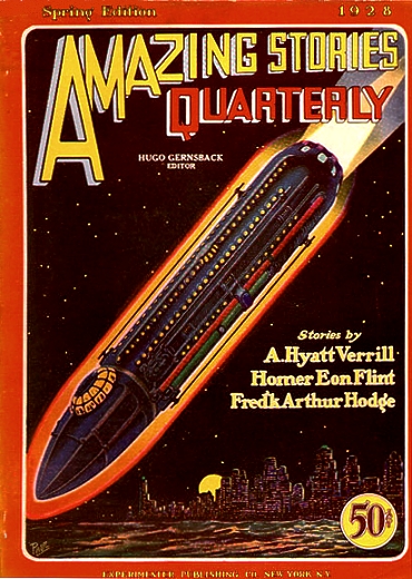
The Victorian Age was the age of large industrial machinery, of pumps and pistons and steam; the science fiction of the Victorian age, the visions of tomorrow of people like HG Welles, reflect this design ethos.
The Modernist view of the post-WWI period is reflected in the design of the machinery, and the society that wraps around that machinery, to give the classic ‘look and feel’ of early sci-fi like Metropolis and Space Opera. The latter style of fiction in particular, as exemplified by the early works of writers like EE ‘Doc’ Smith, projects the technological developments of the era into space – elements of which survive to this day. Thus, the “Battleship of space” is the most powerful weapon out there, and the while guns may now operate on “rays of radiant energy” instead of shells, their combat characteristics are clearly analogous to those of their earlier, sea-locked, namesakes.
In World War Two, supremacy came to be represented by the Aircraft Carrier. The look and feel of the space opera era, stretched to accommodate the carrier, and married to a stripped-back 1970s aesthetic, produces the imagery of Star Wars with its Star Destroyers and Death Stars.
The utilitarian style of the 1950s and 60s, when projected into the future, is expressed by the look and feel of the sets of the Enterprise on the original Star Trek TV Series. There is little ornamentation, and function clearly dominates aesthetics everywhere human that they go. For budgetary reasons, the show made use of a lot of sets and props from other shows and productions to represent alien worlds and civilizations, which is why some have Greek columns and so on; these can’t be considered indicative of the design philosophy of the future, they are too heavily compromised by production necessity.
In the 1980s, changes in design aesthetics were taking place, and the perfect reflection of those changes can be seen in the bridge of the Enterprise-D of Star Trek: The Next Generation. There is more space, there are carpeted floors, there is wood paneling, and there are artistic curves for no better reason than being able to use an aesthetic shape without compromising functionality. The same design trends, earlier in their development, and with less ostentation, can be seen in the visuals of BBC science fiction of the era – most especially, Blake’s 7.
It’s always easier to see these trends, and the implications of the consequences of past trends, from a distance. The changes in design aesthetic from the original Star Wars Trilogy to the Prequels is a mirror to the changes in the look-and-feel of the cutting edge of military design of the era, which in turn is reflected in the look-and-feel of everything from the shape of cups to the design of coffeepots and water jugs. Who can fail to see the connection in design style between the SR-71 blackbird – then the cutting edge of design – and the ships used by Obi-Wan and his mentor in those movies?
The connection between the way we see the future and the most “modern” look of the world around us is obvious in still more examples. The original Tron comes to mind. 2001 A Space Odyssey. Westworld (excluding the actual simulated past worlds themselves).
You can continually date the production date of sci-fi media by the way they envisage the look-and-feel of the future, because they are always looking forwards from the “now” of that production date.
The writers and designers of Star Trek Voyager were able to play on these values very cleverly in the “Captain Proton” episodes. I always knew that these worked by evoking the style of the 1930s sci-fi serials; I simply didn’t appreciate how – until this connection between “modern design” and the look-and-feel of the future occurred to me.
Necessity
To some extent, this is necessary. Audiences have to be able to relate to the world depicted and immediately feel like it is the future. That means taking the design styles that they think of as “Modern” and projecting them forward. It only takes a little imagination to see how badly it would work if someone were to put Wedgewood China on the table in the Death Star; it’s so incongruous that it immediately raises a chuckle, if not a laugh.
The Application to RPGs
Genre to Subgenre to Style to Look-and-feel – that’s the essential lesson to be learned. Traveller is very 1930s/40s/50s space opera sci-fi in style and subgenre, and the look-and-feel of everyday objects, as described by the GM, should reflect that design sensibility. Those objects would have a completely different look and feel if you were running a Star Wars RPG, or Babylon-5, or Dr Who. Even Car Wars has a very Mad Max look-and-feel behind it. The trick is to take advantage of the heavy lifting done by the designers of the original media apon which these games derive. Everything from clothing fashions to furniture, from spaceships to architecture, should correlate.
When those designers have let the aspiring author down by not actually showing an example, you can often extrapolate from what they have shown you without really thinking about the design philosophies behind it all. Most GMs do this instinctively.
Sometimes, the required object is so far removed from what has been shown in the original media that this is not enough, and this is also the case when (shock! horror!) you are trying to achieve something original. That’s when you have to start looking deeper, extrapolating the existing look-and-feel to the core principles and philosophies behind them, and then projecting those principles and philosophies into the conceptual designs of the desired object.
From this point, the article is going to start drifting down some strange byways, the relevance of which may not always be clear. Bear with me.
The Philosophies Of Design
Every time period in industrial design is characterized by a particular style. The unity of style that makes it characteristic derives from the philosophy of design that is expressed in individual examples of that style. Each time period is dominated by one or two such philosophies; they are like schools of art (and often parallel contemporary art movements). So intimately connected are these two strands of expression that art movements and design styles often share a common name, and seem to go together in a period setting. If the art doesn’t match the colors and textures of a room and the objects within, the whole doesn’t look quite right.
The initial subsections of this part of the article are synopsized highlights of excerpts from The Genius Of Design.
Pre-WWI
Following the turn of the 19th century, the height of design was the Art Nouveau movement. Over-decorated, with aesthetic properties so dominant that function was often compromised for the sake of appearance, conspicuous artistry was the hallmark of the age.
Post-WWI
The Bauhaus movement was a rebellion against Art Nouveau. Post-WWI, it sought to strip all ornamentation from design, and to simplify that design to the most fundamental and minimalist elements. It was dominated by the shapes that were possible from the bending of steel, especially tubular steel. There was, nevertheless, a certain elegance to the Bauhaus design which is one of the reasons why it persists to this day and still looks modern and futuristic, approaching a century after the beginnings of the style. The fundamental tenet of the Bauhaus movement was “Form follows function.”
WWII
World War II mandated efficiency as the core goal of design. Moving parts were reduced to the bare minimum, and function was elevated even higher, to the point where it almost completely obliterated any consideration of aesthetics or ergonomics (referred to at the time as “Human Factors”. Simplicity, and the ability to mass-produce a product as quickly and cheaply as possible, to be able to use and maintain it with as little instruction and expense as possible, these were the goals imposed on all design of the era. The diversion of substantial manufacturing capacity into the production of war material on all sides of the conflict meant that the same design ethos translated into what civilian products were available.
Post-War
The end of the war brought an end to the economic suffering tolerated by the civilian populations while the conflict was playing out. With manufacturing once again devoted to civilian production, the design ethos of the war became directed toward everyday objects; but the sensibilities of the time now redefined “functionality”. Comfort was the driving demand of the post-war consumer, and satisfying this demand while maintaining the efficiencies (and hence affordability) of objects became the primary requirement of design. To achieve this, it was necessary for the concept of function to expand, incorporating the new concept of “human factors”, which was becoming known as “ergonomics”. To succeed in this era, it was necessary for an object to first, perform whatever function it was supposed to achieve, second, be affordable to the mass markets now coming into existence, and third to provide comfort and reassurance to the user. Decoration, ornamentation, and aesthetics were all secondary contributors to this comfort and reassurance.
I missed one episode of the series, so these next sections are a personal extrapolation from other sources and of patterns that have been personally observed.
The Birth of Plastics
The post-war science boom of the 60s resulted in new materials reshaping the industrial landscape; the results were plastics, and Tupperware. Initially, these were so modern in their qualities – cheapness, light weight, and versatility – that a plastic product was synonymous with quality. One of the reasons why plastics became so ubiquitous was that they permitted the satisfaction of a rising trend: self-identification through color and style. In an extremely limited sense, aesthetics had made a comeback as a separate principle of design. By restricting the palette of choices, variations in design became mass-producible. This was the ultimate manifestation and recapitulation of the principle that first ushered in the world of modern industrial design; Henry Ford’s Model-T which was available “in any color you wanted, as long as it was black” vs. Chrysler who found ways of keeping the engineering the same while varying the external shell, and offering consumers a choice.
This was also the rise of the concept of the teenager, and of directed marketing. The underlying engineering of a transistor radio might be the same, but the exterior could be altered to appeal to one particular market segment – teen girls, teen boys, single men, stylish women, families, and so on and on. Prior to this point, people were thought of as transitioning from the stages of childhood directly into being “young men” and “young women”; it was the identification of an intermediate stage, the “teenager”, and marketing directly to that population segment, that established the concept fundamentally within modern society.
The ’70s
Over the next decade, environmentalism became a significant social force, and plastic products became so ubiquitous that the glamour was lost and “plastic” became synonymous with “cheap” and “nasty”. The pre-yuppies of the 70s began to decry the sacrifice of build quality for cheapness, and demanded a rebalancing of the price-vs-quality balance. A demand to return to “traditional values” was also gathering strength as a reaction to the hedonism of the 60s and early 70s, and coincided with the rise of appliances made of metals and woods. The “brushed aluminum” look seems symbolic of the era.
The ’80s
In the 1980s, the yuppies became ascendant, and these trends were carried to fruition. “Faux-natural” became the dominant look – simulated wood-grains on plastic and metal appliances and a seemingly-final divorce between appearance of materials and actual construction. It became acceptable to manufacture something out of whatever materials were appropriate to the engineering and make them look like whatever materials were in-demand aesthetically. The Yuppies were upwardly mobile, or wanted to think they were, and they insisted on looking like they were successful – at a price they could afford, but the lower classes could not. Aesthetics and ornamentation once again reigned supreme. This was a decade of excess.
Here is where the missed episode ended, and the series began to wrap up. What follows is a blend of the content and enlightenment it provided and some notions/observations of my own.
The ’90s
In the 1990s, we began to pay the price of the piper. Every extremist movement in design generates a counterculture that gains ascendancy, or incorporation, in the ensuing era. It was in the 90s that once again saw a stripping back of ostentation, which had once again reached the point where aesthetics were dominating functionality. Over the course of this decade, customizability and individuality would become resurgent, and the keywords were once again functionality and flexibility, but this time without the crassness and lack of true aesthetics of the 60s and 70s. In fact, there was something of a design “war” between the functionalists and the aesthetes over the course of the decade.
Computer Interfaces: Mac vs. PC
This was also the era of the rise of the personal computer, and this design war was reflected in the two dominant styles of Personal Computer. From Apple, we had the Macintosh, which sacrificed customizability of appearance for commonality of interface, which was a doorway into greater ease of use and hence functionality; from Microsoft, we had Windows, consistency was sacrificed to individuality and customizability. One was almost industrial in on-screen appearance, while the other was splashy and colorful for no better reason than that it made it stand out.
Integrated personal customization of aesthetics and interface was one of the defining differences between the two operating systems, and the hardware differences were simply along for the ride. People didn’t choose between the hardware differences of the two brands (there may have been exceptions), they chose between the operating systems and underlying philosophies, and bought whatever hardware was necessary to create an environment in which those operating systems could perform. The Mac had very limited customizability, while Windows was more flexible, more difficult to use, less reliable, but offered the user far greater control over not just what functions the device could perform but what those functions looked like on the screen. This was a battle that Windows would ultimately win, a victory of flexible ostentation over minimalism – a point to which I will return in due course.
IKEA and The Noughties
As it was on the computer screen, so it was in the real world. The surprise winner of the style wars was someone who had been there for decades without changing their essential design philosophy. The world evolved to catch up with their way of thinking and discovered the Scandinavian furniture company ready to satisfy their evolving tastes. IKEA had been founded in 1943, been small through the 40s, 50s, and 60s, growing in the 70s and 80s, and in the 90s and 2000s became absolutely dominant in the field of furniture retail. Offering quality products at an extremely affordable price by engineering them for self-assembly (cutting out one of the primary production phases and associated expense), the mix-and-match approach to combinational diversity permits the customer the ability to shape his furniture choices to fit his style and environment. In many ways, this is the ultimate expression of design; functionality combining with flexibility and aesthetics at a mass-consumer price.
From this point forward, I am again on my own, reporting my own observations and analyses. As the review intimates, The Genius Of Design doesn’t advance beyond the point of the Design War.
Hard on the heels of the first wave of global success by IKEA came the DIY renovation boom of the noughties. It was no longer enough to customize the choice of objects within an occupational space; now that space itself would be customized to fit the ‘vision’ of the home renovator. This was an expression of the same trend which won the operating-system war between Apple and Microsoft, and which had made IKEA a household name in 38 countries.
German design during the years following the rise of Hitler had obsessed over achieving perfection of function and delivering identical expressions of that perfection as products. The DIY era represents as completely-180-degrees turn in dominant philosophy as it is possible to envisage; while the underlying mechanics may achieve ‘functional perfection’ (or as close to it as it is possible to come), the objective of the German design philosophy is taken for granted, and the point of distinction between rival products is what you put on top of that underlying mechanics.
Looking ahead to Now
That subheading might seem strange, but it’s perfectly expressive when you realize that only distance lends perspective – in this case, distance in time. In this subsection, I’m going to try to identify the design trends that are just beginning to manifest themselves as new movements “now” – but to gain the necessary perspective, I have to look ahead to a time when current events are sufficiently distant that the significances can be seen.
It’s my personal theory that computer technology is more responsive to changes in design ethos because there is no need for the production delay, the lag between conceptual design and the manufacture of physical products that reflect that conceptual design. This enabled the Mac-PC design war to anticipate the rise of the DIY-boom, and it means that by examining the current trends in computing it should be possible to anticipate where design is heading right now, but hasn’t quite reached yet.
Apple Redux
Apple is at the forefront of two different design philosophies with three of its products. The first is the iPod, which strips functionality to its bare minimum and presents it in a form that is capable of infinite redressing and customizability. Lesser exemplars of this design philosophy are gaming consoles, which extract one function from the domain of the PC and place it in a purpose-driven appliance. It can be argued that the iPod is the ultimate expression of the minimalist/customizability architecture, but I don’t think so. The same underlying philosophy appears in the iPhone and the iPad, a trio of products that exemplify the modern design ethic, but which have not yet reached full expression.
At first glance, the iPhone and iPad seem to be cut from entirely different cloth to the iPad; but look beneath the surface and a similarity of design ethos becomes apparent. They are both successors to the “Mac” way of thinking, in which you can choose the functions that you have but not the look and feel, dressed up in the flash and color that won Microsoft round one of the contest between the two companies. Both the iPhone and iPad are computational devices that use “apps” to add selected functionality to the basic device; customizability of function, in other words – but these occur at the expense of customizability of interface. You have to use these products the apple way, or not at all.
Products to order
The phenomenal success of these products and this approach over the last five or so years marks this as a dominant design trend that has not yet fully manifested in other fields of design. yet, the promise of modern technology is that it will do so, through the advent of 3D printing. Using an appropriate App, the future of design appears to be the capacity to integrate desired functionality from standard IKEA-style mix-and-match building blocks to produce a uniquely-customized functionality that does exactly what we want it to, and then produces the product to order. It used to be that having products made to order was the mark of wealth and personal prosperity. My first prediction is that these technologies are about to democratize this mark of privilege.
Cloud Computing: Form over function
The second trend that has been gathering strength over the last decade or so is the advent of cloud computing. This essentially separates function from interface, enabling that interface to be a customized front end to a common functionality set. Another way of looking at this trend is this: the removal of the need to compromise aesthetics in order to accommodate functionality. How will this play out in the real world of physical products, how will it manifest? That’s a little harder to see.
A partial answer lies in the advent of another design trend: centralization. More and more, one product is doing the work of what used to be a multitude. Once, I would have had a sound system to play music on, and physical media on which that music was permanently stored; these days, the music is in the form of impermanent digital files, and my computing device plays them for me. The same device can be a word processor, an email application, and a telephone, all at the same time. Moreover, by simplifying the hardware requirements, cloud computing makes it possible for ever-greater functionality to be expressed remotely. We haven’t yet reached the point where our interface device connects to custom-made back-ends that provide only a specialist function, but the day is surely coming. Having a massive user-base enables a different kind of economy of scale, something more akin to the infrastructure developments of the early 20th century, and sooner or later someone will identify a function that requires custom-built infrastructure at the functional end but which can be controlled through a ubiquitous central front-end interface at a lower cost than is possible providing all functionality at the user end (if they haven’t already done so).
Don’t see it? Here’s one possible example of how life might change to express this design philosophy: You specify a meal several days in advance by selecting all the recipes from a menu on your central device. The device polls the appliances in your kitchen to determine what parts of the work you can do for yourself with the tools you have at hand and which should be prepped in advance by the machinery at the store. Ingredients are automatically ordered, including whatever preparation is needed to make the recipe compatible with your equipment, then delivered on an appropriate time and date. Your central control device tells you, step by step, at the right times, what to do to complete cooking of the meal – “Take chicken pieces out of refrigerator (do not open bag). Place in Microwave. Touch key when step complete.” You don’t have to tell the microwave/oven how long to cook them for; the recipe does that, via the central controller. The menu you have chosen, the recipes you have chosen, are assembled with minimal personal activity and intrusion in a way that has been customized to the capabilities of your equipment, and perhaps to your level of culinary expertise. It might even tell your TV to pause your programme while you are busy. Sounds like science fiction? I reckon it’s maybe a decade away, maybe less.
Neo Nouveau
Before the PC, Design had been focused on physical objects. In the modern age, with more and more functionality being provided by virtual objects in a digital domain, design has had to expand in meaning. It is now all about aesthetics, interface, and control. You can have many different MP3 players, but they all have the same basic functionality; every “virtual object” intended to perform a function is differentiated from all others intended to perform that function by aesthetics.
With interface divorced from functionality, there will be a resurgence in the ornamentation of those interfaces, and this will be reflected in products in the material world. 130 years after the Art Nouveau movement flourished, ostentatious decoration will once again be able to flourish.
Into The Future
Every trend gives rise to its countertrend, which becomes central to whatever comes after it, as I said earlier. So successful has the iPhone/iPad “App” interface been that Microsoft have copied it for Windows 8, abandoning its own fading central design ethos in the process. And already there is a backlash; people don’t like being told what to do, and don’t like to be told how to do it, and don’t like to feel out of control of the process. Microsoft always catered to the customizability market, and as a result, has been encountering resistance and vilification of its new OS from some quarters. The same thing happened when they introduced the “Ribbon” in Office 2007, and when they introduced Vista, both of which represented unpopular attempts to change the way people interacted with their computing devices; only by taking at least a partial backwards step were these changes made at least partially palatable. Already, there is talk of such a backwards half-step in Windows 8.1. A number of Microsoft customers went from Windows 98 direct to Windows XP to Windows 7, skipping every second generation of the OS. Unless Windows 8.1 contains just such a backwards step, I would fully expect a substantial share of the market to wait for Windows 9 – if the company survives that long. The problem is that by deciding “if you can’t beat them, join them”, they have hitched their collective futures to a trend that’s already at or approaching its zenith; instead of preparing to provide the next big thing, and accepting lean times in the meantime, they have mortgaged the future for more immediate expediency – and this at a time when it will only take a small improvement in user-friendliness for Linux to steal the market share that feels abandoned by Microsoft, and when Google is developing its own Operating System to compete with Windows. It’s either going to be a masterstroke or the biggest mistake in their corporate history.
In the interests of disclosure, I should state that I currently use Windows XP, and still have not been able to replace all the functionality provided by software that I used to have on my Win98 system just 2½ years ago. I may eventually be forced to migrate to Win 7 – but that day is years away, because I already know that some of the software that I use every day is not compatible with the new system and replacements are either not available or very expensive. Heck, some of the software that I use regularly was written for Windows 3.1, and there is nothing out there that is as user-friendly, even though there have been many years of software development since. So I may be biased – but every complaint about Microsoft’s products cited in the preceding paragraph came from one or more third parties, so I’m not alone.
That countertrend will be exhibited in every other aspect of design in due course, and the seeds of that trend are also evident, if one looks for them. As the review of “The Genius Of Design” points out, not everyone is a genius of design, and for every renovation that succeeds, there’s at least one that makes the viewer cringe. The opposite to self-expression through design and choice is the consultation of expertise, and a unified style with customization restricted to those choices that meet an arbitrary standard of good taste. Restraint and elegance for the masses, guided by consulted expertise and people who make a profession from “designing a living” will be the most probable wave of the future in rebellion against what I’ve described as the Neo Nouveau movement. Decoration will be sparing and restrained, used as a highlight or an accent – and “Less is more” will once again be in vogue. 2040 or 2050 might really look like the Bauhaus predictions – with decorative flourishes on top.
Getting To The Point
As the above should make clear, design trends don’t exist in a vacuum. They both shape, and are shaped, by the society around them, which in turn is shaped by the economic realities, which is itself an outgrowth of social and political forces. Successful designs embrace and satisfy whatever the dominant demand is of the surrounding society, and designs that don’t do so, don’t sell. Earlier parts of this series showed you how to determine the shape of the technology of the society by extrapolating from modern implements, appliances, and social trends; this postscript shows how to reflect the resulting changes in the design of everything else to be found in that world. The ongoing oscillation between decoration and functionality is part of human nature; it will continually find new modes of expression through new social trends and new materials, but the fundamentals and their impact aren’t going to go away anytime soon.
In fact, they probably won’t go away until we get exposed to some alien viewpoint – whether that be from outer space or from an artificial intelligence with its own sensibilities remains to be seen.

Discover more from Campaign Mastery
Subscribe to get the latest posts sent to your email.


June 14th, 2013 at 4:11 am
Great stuff. This is by far my favorite series you’ve done so far.
I ran a cyberpunk game a few years back in which I considered a number of these elements.
I think with current trends towards micro-manufacturing (Print On Demand, 3d Printing, & other things) as well as virtual storefronts (amazon, etc.) customization will continue to rise.
Edward Lockhart recently posted..Blog Carnival: Favorite NPC(s)
June 14th, 2013 at 4:52 am
Good to hear from you, Edward, and I hope the enjoyment means that you’ve been able to take something away from the articles to inspire you in your games :)
June 22nd, 2013 at 4:46 pm
[…] Creating the World Of Tomorrow: Postscript – The Design Ethos Of Tomorrow […]
November 8th, 2016 at 2:24 am
[…] Mike turned out an extension to his series on “Putting The SF Into Sci-Fi” entitled, “The Design Ethos Of Tomorrow” inspired by it. You might also want to read this extensive review of the series if you need […]