Image Compositing for RPGs, Part 1: Basics & Tools
- Image Compositing for RPGs, Part 1: Basics & Tools
- Image Compositing for RPGs: Project No 1
- Image Compositing for RPGs: Project No 2
- Image Compositing Project No 3, a Blue Monkey

I thought about breaking with tradition and not putting an image at the top of today’s post, but changed my mind when I realized I had no idea what image social media would associate with the post. This palette image is by Alexander Lesnitsky from Pixabay, but I’ve tweaked it a bit to let it be a little bit bigger than the other images in hopes that this will make Facebook think it’s more significant than the others.
A picture, it is said, is worth 1,000 words. Sometimes, it’s worth more than that. In an earlier post, I posited that the GM should make darned sure that he gets a full thousand-words-worth out of an image if he is going to spend serious time editing it.
Past posts on image construction and editing have proven quite popular, so I thought I’d do another one.
Because of the number of images to download, this post might be a little slow to load – my apologies for that, but I think it will be worth it.
The Fundamental Principle
Whenever you edit an image, you should always have a firm purpose in mind. In so many cases, the basic technique is to manipulate the image and decide whether or not the manipulation takes it closer to serving that purpose. If it does, fine – move on to thinking about how to get it even closer; if not, try something else.
Layers
I work a LOT with layers. For one thing, “undo” doesn’t always work seamlessly, and for another, sometimes you need to do something else with the base image. So for a start, never manipulate the base image; always work with a copy which is, essentially, a second layer.
In addition, you can take parts of an image and manipulate them in different ways by putting each part in a different layer; and you can specify how much each layer contributes to the final effect. That’s controlled by something called Opacity.
Compositing Modes
There are several ways that different layers can interact to create an image. There are seven that I use regularly – addition, multiply, darken, burn, color, alanon, erase, and grain merge. There are dozens of others in Krita, the image editing software that I do most of my work in these days, but those are the most common.
Let’s start by illustrating the different compositing modes, and some of the things that you can do with them.
To do this, I’ll be working with this image:

City image by Jo Wiggijo from Pixabay
This is a US city skyline; the image information doesn’t tell me which city, but that doesn’t matter.
Opacity
First, against a white background, here’s a demonstration of opacity:
100% is exactly the same as shown above.
70%:
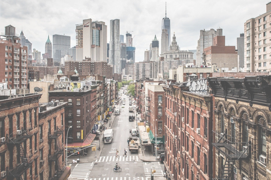
See how the white background is showing through?
50%:
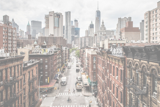
20%:
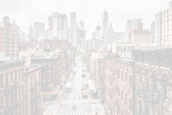
The image is almost completely faded away.
If I change the background color to a medium-dark, slightly gray, yellowish brown:
100% – still the same as the original image
70%:
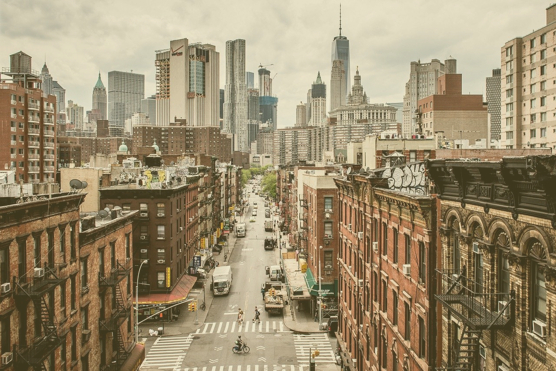
50%:
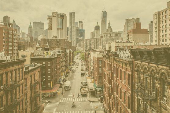
20%:
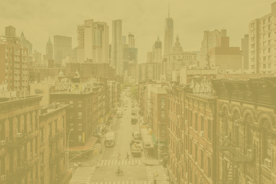
If I wanted to make a sepia-toned version of the image, I would usually base it around a desaturated copy, with the original reduced to almost complete zero opacity, and probably with a multiply composition mode for both, and a lighter background – but that’s getting ahead of myself. The point would be to leave just the merest vestage of the original colors – I’ve learned from experience that this looks more “real” than using pure color. You can judge the color of background to use by remembering that this is what the lightest color will be – the parts of the image that are white on the original.
Okay, so that’s opacity.
Addition
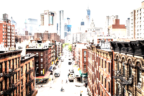
So, making a copy of the image and applying Addition as the composition mode produces this, with both layers at 100% opacity.
100%:
To understand composition modes, you have to be aware of how colors are understood by the software. This depends on something called the color space, and there are several different ones, but the one I use most often (because it’s the same one used for web pages) is RGB, or Red-Green-Blue. Each of these colors is described by a number from 0 to 255. If all of them are at maximum, you get white (255,255,255); if all of them are minimum, you get black (0,0,0).
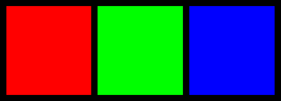
If the Red channel is 255 and the others are 0, what you get is pure red (255,0,0). Similarly, Green from the Green channel (0,255,0) and Blue from the Blue channel (0,0,255): I think of these as the Primary Colors of RGB mode.
Each of these colors also has it’s opposite:

Cyan (0,255,255) has no red in it; Violet (255,0,255) has no green in it (and always looks very pink to my eyes); and Yellow (255,255,0) has no blue in it.
In combination, these numbers permit 1,6777,216 separate colors, variations so subtle that you can’t distinguish one from another. It’s estimated that the human eye can see about 1,000,000 colors, so this permits faithful photography. The intermediate values are necessary, though, to permit the smooth transition from one color to another.
So, the composition mode basically takes the value for each channel from both images and performs that mathematical function on them. Anything less than zero yields a zero, and anything more than 255 yields 255.
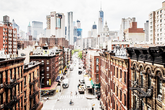
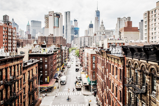
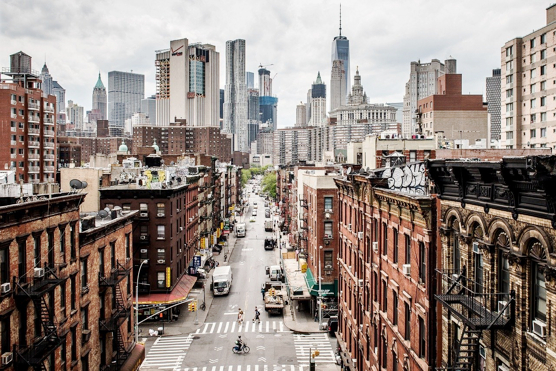
Addition, then, doesn’t change the dark areas much, but increases the brightness of the light areas.
The opacity of the layer being added to the base image controls how much of an adjustment takes place.
At 70%, 128 + 128 becomes 128 + (70% x 128) = 217.6 (I’m not sure how the program deals with the 0.6, it might round up or down, but the difference wouldn’t be noticeable anyway).
At 50%, 128 + 128 becomes 128 + (50% x 128) = 192, and so on.
The results are thus:
100% – as shown above.
70%:
50%:
20%:
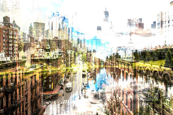
Where this gets interesting is where two images are being added that have very different colors and shades.
For example, if I take this image:..

Forest Lake image by David Mark from Pixabay
…and Add it to the base city image, this is what happens (shown at different opacities):
100%:
70%:
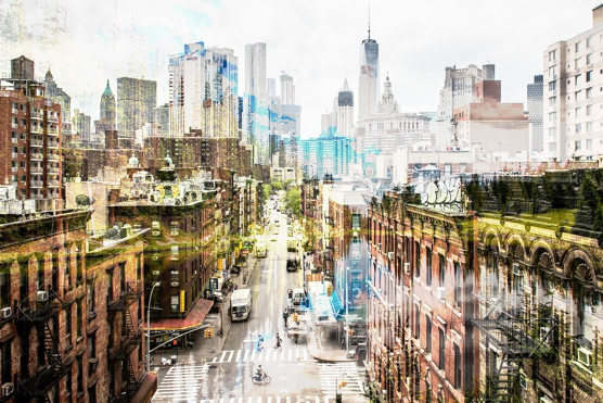
50%:
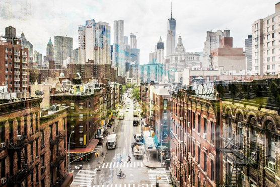
20%:
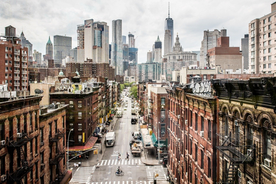
The main purpose for which I use addition is to make room for multiplication effects. I’ll talk about that a bit later – but, for a long time, I didn’t use this compositional mode at all, and relied on tweaking the brightness and contrast of a multiplied image. Putting an addition layer in between gives me a little more control over the creation of the image.
Multiply
Multiply is a little trickier to understand, because (technically) it’s misnamed. If you multiply an image color by white (255,255,255), it’s unchanged. If you multiply it by black (0,0,0), it becomes black. More interesting things happen at in between values.
Here’s the city image, multiplied by itself:
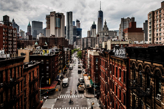
Right away, you can see the utility of this mode – the contrast of the image is enhanced. The foreground buildings are now too dark, but the skyline buildings are suddenly crisp and sharp.
By altering the opacity of the multiplied image, you can control the effect.
70% opacity:
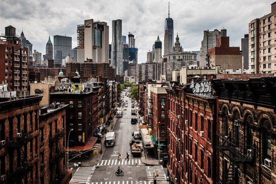
50% opacity:
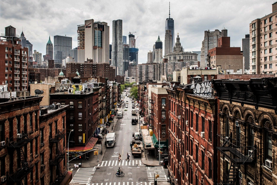
20% opacity:
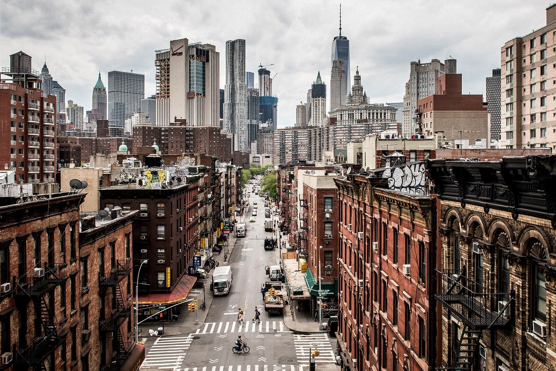
By breaking an image up into multiple layers, each one multiplying the base image, and varying the opacity of each layer independently, you can control the contrast of each part of the image. If you carefully fade the edges of the different areas, the effect can be seamless.
If I were working this up for use in an RPG, higher contrast is important because optimum viewing angle hardly every occurs, the image is usually too light, especially when viewed from any distance (like, the far end of the table). So I would leave the foreground buildings un-multiplied, or with a very low percentage like 3% or something; I would use 20% for the mid-ground buildings; and I would use 100% for the skyline buildings. Which only leaves the question: what about the sky? For a gray, overcast day, I would use 20% or maybe 50%, because it makes the cloud formations stand out a little more. For a stormy day, I would not only use 100% for the clouds, I would use another multiply trick (that I’ll cover later) to tint them. And for more clement weather, I would use addition to brighten the sky and remove some of the cloud detail and then the same multiply trick to make it a blue sky.
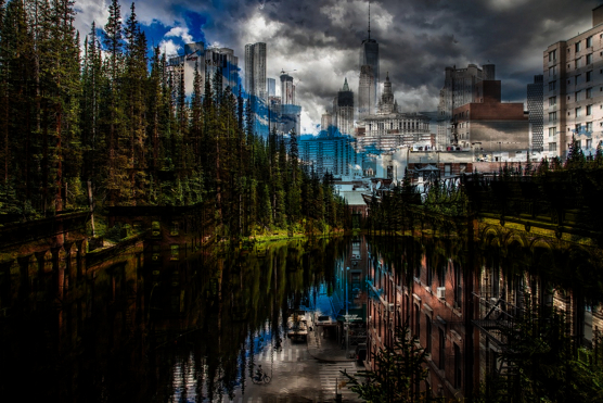
Once again, with different colors from a second image, things become more interesting.
Here’s city multiplied by lake 100%:
And here’s lake multiplied by city at 100% opacity:
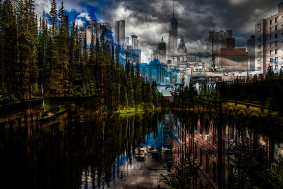
Don’t see any difference? That’s because there isn’t any! But if there was a third, different, layer in between, the effect would be marked.
Here, for example, I’ve added a yellow ring beneath the lake multiply layer:
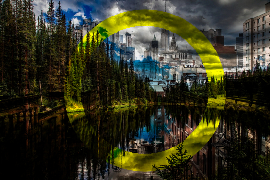
….and lake and yellow ring multiplied by city 100%:
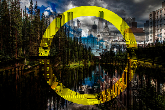
And, if I take away the part of the city image that’s outside the yellow ring, make the ring blue, and decrease it’s opacity to 23%, I get:
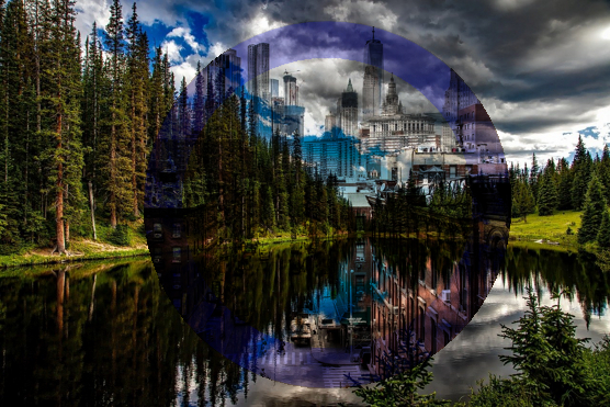
This is good but not quite right – I want to fade (i.e. reduce the opacity) of the lake part inside the ring so that the city is more apparent. Using the slider, I settle on an opacity of 65%, and make sure that there’s a white foundation underneath. Here’s the result:
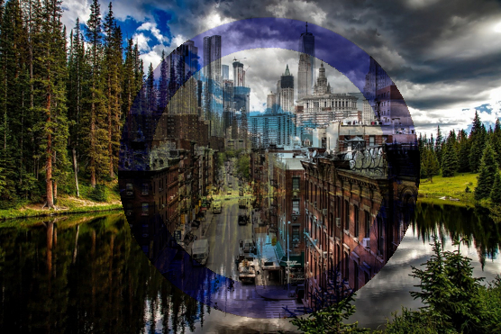
That’s not bad. If I were doing it for real, I would have worked harder on the ring, blurring the inner edge, maybe filling the inner part with a halo of even less opaque blue, multiplying the skyline section of the city by itself, and maybe adding a second ring. I would also have moved the ring(s) and city section so that both images had the same vanishing point. These small touches would all enhance the image. But this is good enough to demonstrate the basics of using Multiply.
Darken
If you darken a copy of an image, you see absolutely no difference – which is completely different to what happens when you use multiply.
To see any effects, the darken layer has to be different in some way to the layer being darkened.
Here’s City Darkened by Lake at 70% opacity:
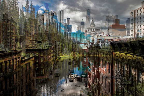
And 30% opacity:
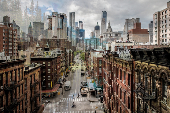
Darken doesn’t change the color values in the same way that multiply does. That’s occasionally useful for shadows and special effects.
If you create a copy of the image and convert it to grayscale (i.e. Black and White), and then invert that image (so that black becomes white and vice-versa), you can use Darken on colored areas to deepen those colors – sometimes a useful trick. But you can achieve the same effect with Multiply. So I don’t often use this compositing mode – but every now and then, it does exactly what I want, when multiply won’t.
Burn
Burn introduces another concept, another way of looking at the colors of an image: Saturation. When a copy of city is used to Burn the base image at 100%:
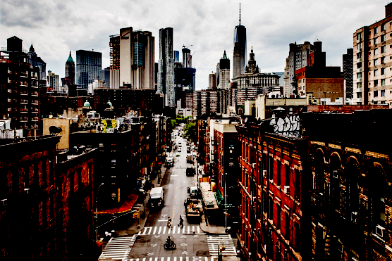
As you can see, not only are the darks much darker, the same as multiply, but what colors were present are also much richer and deeper. That can be useful when combined with an intermediate addition layer, or a compositing mode that I haven’t mentioned (and rarely use), Lighten.
Here’s a multilayered composite:
- At the bottom is the base image.
- Above that is an addition layer at 64% opacity.
- Then there is a burn layer at 79%.
- Then there’s a multiply layer at 30%.
- And then another copy of the base image at 42%.
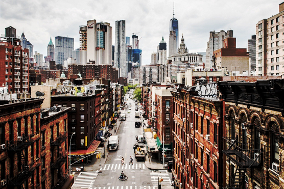
The net effect is that colors are more saturated, but not garishly so, and the skyline is accentuated, but the darkening effects on the foreground buildings are far less pronounced. The image is, basically, clearer.
Color
This compositional mode replaces the colors in the base image by the colors in the Color layer. The lighter the area of the base image, the less it is affected. But black is unaffected.
The results are often counter-intuitive. Here, for example, is City colored by lake 100%:
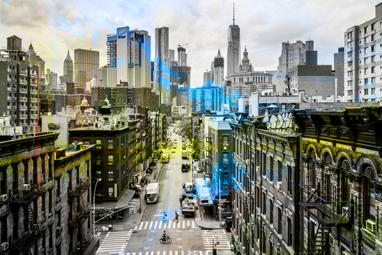
Whatever I was expecting from the combination, it wasn’t that!
You can see the effect more clearly in this image, in which I’ve simply done a red scribble across the image (in a separate layer, of course):

And here’s a closeup, which shows it even more clearly:
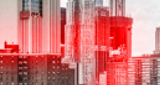
Doesn’t look like black is unaffected, does it? But it is: take a good hard look at this closeup of the Lake image colored by the same scribble:
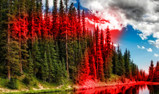
You might think that there’s no value in such an unpredictable composition mode, but I find myself using it regularly to make subtle changes to the colors in an image, especially if I’ve used other compositional modes to make large-scale changes to an image’s color profile.
It’s not the only tool that I’ve got in my toolkit for that. For example, here’s a different view of the lake image – I’ve removed the sky blue into a separate layer and then played around with the red and blue color spaces a little:
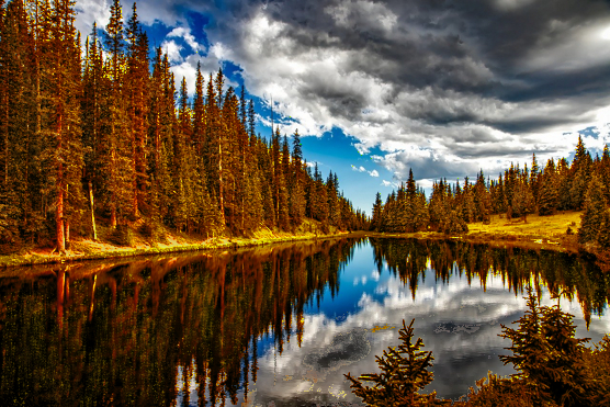
The effect is basically remapping the green to become bright red then adding layers of yellow, green, and brown texture which is then used to provide a color map, giving the impression that individual leaves are something other than the reddish brown. Note that I literally spent just a few minutes on this as a demonstration; I would take far more care if doing this for real!.
Using color, addition, and multiplication shifts the lake scene from summer to mid-autumn, and demonstrates how useful this composition mode can be.
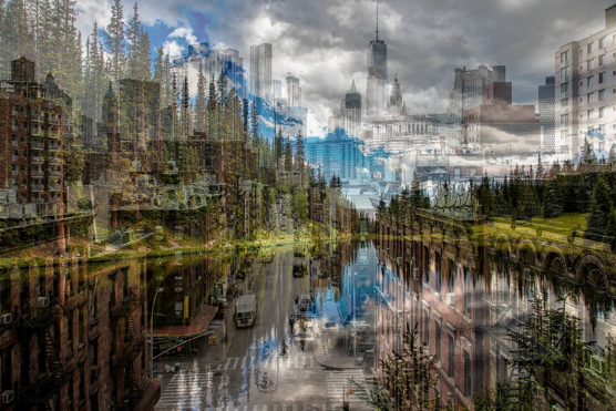
Alanon
Alanon is a mode that I had never noticed until I started playing around with Krita. I’m not sure of what it does in technical terms, but fundamentally, it averages the color values between the base layer and the Alanon layer. This “fades” one image into another.
Used properly, this can be quite potent. If you’re just playing around, however, you’re more likely to end up with a mess.
Below is City Alanon Lake 100%:

Things get more interesting when I add a second Alanon layer at 30%:
Grain Merge
Grain Merge is similar to Alanon, but it takes into account the lightness and darkness of the images, effectively using the Grain image to ‘texture’ the base image.
If I use the City as a grain for itself, the results should look familiar:
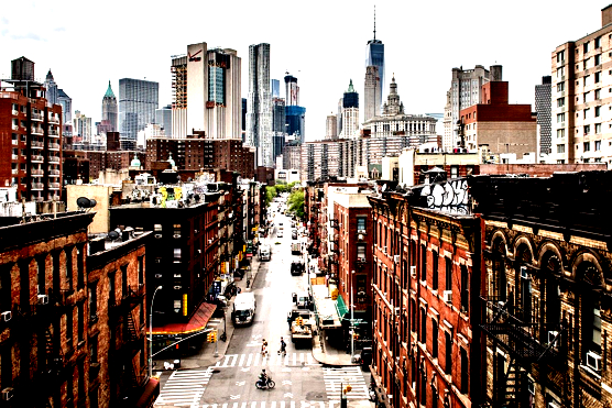
It looks remarkably like the multi-layered image that I presented earlier, doesn’t it? But look more closely: the clouds are all but gone. The street looks like it’s been raining and is now reflecting the sky. A lot of other light-colored areas are also washed out but bright – the contrast has been boosted significantly. That means that I could replace the streets in the composite image with this ‘rain-slicked’ version, keeping the clouds visible, but using the ‘flare lightening’ effect.
Grain Merge is rarely the top layer of an image, rarely the final step. Instead, it can often be useful for providing foundations for later layers to work on.
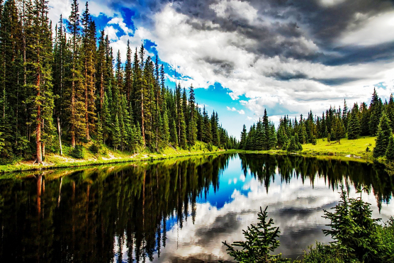
It’s also most useful in small doses (without a high opacity in other words). For example, here’s our Lake Image in a multilayered form:
- At the bottom is the base layer, as always.
- Above that, addition at 73% opacity.
- Then Grain Merge at 28%, darkening and enriching the colors, especially the darker ones and shadows.
- And then Alanon at 50%, which also darkens the resulting image (because of the addition layer), but impacting especially the lighter areas.
The result is still lighter and brighter than the original image, but not (quite) garishly so:
Like all compositing modes, Grain Merge is a tool – sometimes it’s useful, other times, you don’t need it.
Erase
Erase reduces the opacity of an image according to the opacity of the erase layer. Doesn’t sound like much, does it? But it can be incredibly useful.
Erase as I use it always involves Three Layers: The base image, the target layer, and the erase layer. That’s because when I combine the erase layer and the target layer, only the target layer gets erased, permitting the base image to show through.
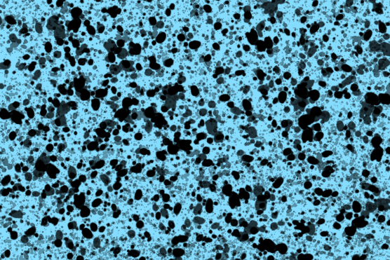
Here’s an erase layer that I’ve put together (with a blueish background). It’s basically small spots of black in various opacities, selected more or less at random: Note that the background is a completely separate layer so that I can turn it off – but because Campaign Mastery’s page color is white, it wouldn’t show up very well.
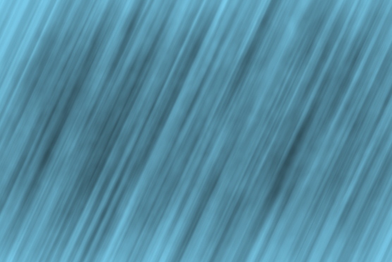
Next, I apply motion blur with a long blur length – 400 pixels in this case – at an angle of about 65 degrees to the horizontal:
That’s close but not quite the effect that I want. So I repeat the blur:
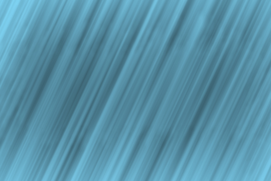
Much better!
Now, with a base layer of white, and a target layer of the city image, I get:

If I go from a white background to a bluesih one, the effect becomes more visible:
Also, notice that around the edges, the erase effect fades. I don’t want that. The solution is to enlarge the erase layer. 125% is about right:
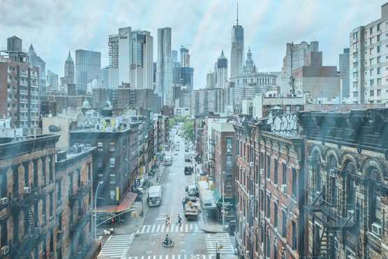
Because I haven’t yet combined the erase and target layers, everything is being erased. As soon as I combine the two, change the background back to white, and enhance the effect a little with multiply, I get
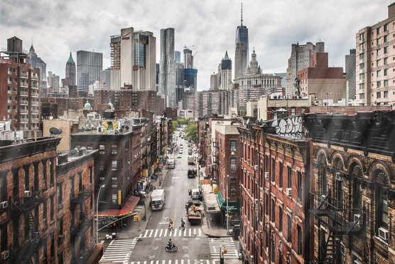
Still doesn’t look like all that much – it could be the city viewed through a reflecting glass window, or something. But when I add some more layers with blur – blue-white spots, smaller ones, this time, and some that aren’t blurred at all:
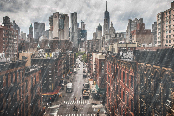
I get a rainy city.
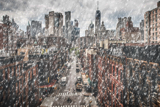
And, if I add still more particles of white, and enhance the contrast a bit, I get a snowy one:
In Part 2:
I stated at the start that you should always have a clear purpose in mind before you start altering an image. That purpose could be nothing more significant than “what does this do?” – but most of the time it will be, or should be, more directed.
So, in the next part, I will use these basic tools to complete a number of specific projects:
- An alien woman
- A Blue Monkey
- A Sci-Fi Buddhist
- A Fantasy Citadel
- Using the same foundations and different dressings, a Sci-Fi City
That’s what you have to look forward to in part two!

Discover more from Campaign Mastery
Subscribe to get the latest posts sent to your email.



January 20th, 2022 at 8:05 pm
Hi everyone i suggest you this amazing tool for Convert any png image ro jpg this is the tool site
https://png2jpgpro.com
January 21st, 2022 at 7:06 am
I know of several other sites which offer the same service, but it’s always good to have an alternative – you never know when your favorite utility site for the purpose will shut down. But it’s less and less a problem these days.
March 28th, 2022 at 9:25 pm
What a very good article it is. Thanks for sharing with us.
March 28th, 2022 at 11:11 pm
Thank you, Rashel :) I appreciate the feedback!