Image Compositing for RPGs: Project No 1
- Image Compositing for RPGs, Part 1: Basics & Tools
- Image Compositing for RPGs: Project No 1
- Image Compositing for RPGs: Project No 2
- Image Compositing Project No 3, a Blue Monkey

Palette image by Alexander Lesnitsky from Pixabay, tweaked by Mike.
Last time, in part 1 of what has now become a series (more on that in a moment), I demonstrated the composite modes that I use most frequently, and some of what I can do with them.
But the rule zero of image editing is to always have an objective, a purpose, in mind – a need that the resulting image satisfies for you.
The specific projects that I have in mind are (mostly) inspired by what I found on the Pixabay home page. For some of them, I sought out additional images to add to the composition. The intent is to show (and explain), step by step, what I’m doing.
I will try not to repeat anything from Part 1, or from the earlier post on this subject in which I constructed an image that was half invention and half reality – The Power Of Blur went into detail about how I create masks and composite images from different sources without leaving a tell-tale ‘Halo’ around them.
I also talk about darkening and color-manipulating images (with examples) in Stalking Fear: The Creepy In Non-Creepy Genres – but I’ll be updating that advice in this post. Still, you might find it worth checking out for additional hints and tips after we’re done.
On to business! Today’s post will offer (compressed) step-by-step instructions for the construction and assembly of five different images:
- An alien woman
- A Blue Monkey
- A Sci-Fi Buddhist
- A Fantasy Citadel
- Using the same foundations and different dressings, a Sci-Fi City
In general, these are arranged from the most simple to the most complex, and several use techniques that will be described in earlier sections.
Rule Zero of image editing may be to always have a purpose, but rule zero of blogging is to beware of over-promising. By the time I was finished writing up and illustrating the first project on my list, it was clear that I would not get all five done in time. That meant either taking a couple of them off the list – something I didn’t want to do as they each have a purpose – or further breaking this up into a formal series.
The next image will be rather quicker than the one described below – enough that it probably wouldn’t deserve a full post on its own. Project 5 will reuse a lot of project 4, so those two form a natural partnership. Project 3 will probably need a post all of its own. So that leaves project 2 up in the air; it will reuse a lot of the techniques demonstrated in this post, and a full description of the process probably won’t be necessary; I will want to focus on the novel parts of the procedure. But there wasn’t time to add it to this post, and it probably doesn’t deserve a full post of its own.
So it has been relegated to part 3 of the new series. The undecided question right now is what I will do to fill that post out. Right now, I don’t have an answer that I’m happy with. So we’ll all have to wait and see!
Let’s get started!
Project 1: An Alien Woman
I wanted a black and white image to demonstrate an updated colorization process. The first one that I spotted was the image below. So be it :)
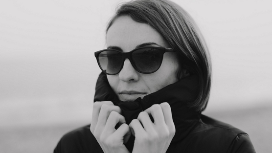
Black & White Woman image by Engin Akyurt from Pixabay
There are two basic approaches to colorizing a black and white image like this. You can multiply the black-and-white image by a color layer, or you can create a color layer and multiply it by the black-and-white image.
The problem is that multiplication also darkens the image, and we don’t want that. So you either do a lot of fussing around with lightness and contrast of the two layers, or you use a controlled-opacity addition layer. Adding dark to dark doesn’t make much difference, adding medium to medium makes light, and adding light to light makes very light.
That then leaves three options to consider: adding a copy of the color mask, or adding a copy of the grayscale image, or adding a combination of both. The latter gives you a lot more control but it’s easy to get confused. My normal practice is to pick one to be the dominant choice, doing most of the work, and use the other to tweak the effect just a little. And I have been known, from time to time, to use a copy of the base layer and a Multiply over the top of the addition just to give a little nuance of further control.
There’s one more trick that occasionally comes in useful – making a copy of the black-and-white image, creating a mask from the lightest tones and then deleting them from the image, and doing the same thing for the darkest tones. This permits even more granular control over the tones and color of the final image by permitting tweaks using other compositional modes like Saturation. But I always regard this as a failure, because it means that I didn’t get the colors quite right in the color layer.
Which takes me back to those three options.
If you multiply the grayscale by the color layer, most of the colors have to be a lot lighter than they will appear in the final picture, almost pastel. Back in the days of the Stalking Fear post, I made a point of that. If you multiply the color layer by the grayscale, simply by using the various controls and layers that I’ve mentioned, you can actually use colors that are a lot closer to the ones that you will end up with, and that makes projects a lot quicker and easier to complete.
So, to the project that is going to demonstrate all this using the image above. I want to use unusual colors in the background, to make the location look alien; and I want to give the girl blue skin, but a more realistic skin tone than is often used even in movies and TV.
So, before I start work, I should remind myself (and tell you) all about skin tones.
- At 200%, 6 pixels becomes 3, 4 pixels becomes 2, 2 pixels becomes 1, and 1 pixel becomes 0.5. The latter can be highly problematic if you’re unlucky, or highly successful if you aren’t.
- At 400%, 12 pixels becomes 3, 8 pixels becomes 2, 4 pixels becomes 1, and 2 pixels becomes 0.5. Fine lines drawn 1 pixel wide will simply seem to blend into the composition – but will still tint the color, just as the arteries have in the eyeball illustration above.
- At 800%, 24 pixels becomes 3, 16 pixels becomes 2, 8 pixels becomes 1, and 4 pixels becomes 0.5. Fine lines drawn 1 pixel wide will simply seem to blend into the composition even more faintly, but you also have the option of 2-, 3-, or 5-pixel-wide lines, which can be very useful. They will all blend in, but to a lesser extent as the size goes up.
- Not sure how big two pixels is? The borderline on all the images in this article are two pixels thick. 1 pixel is often described as a ‘hairline’.
On Skin
Most people start with pink skin when coloring a Caucasian, brown skin for a black man or woman, yellow for an Asian or Inuit, and maybe a slightly redder skin for American Indians, and are inevitably disappointed by the result.
Skin should start as more of a peach color. You layer pink over the top in a texture layer, especially in mid-tones and highlights. Over that, you layer a very fine low-opacity texture in red for arteries and blue for veins. Over that, you add more peach around the edges of the highlights and fade it considerably, then a slightly grayish light brown in the same texture as the pink. Next, you use the same color in a layer for skin tan, or chocolate brown, or a golden yellow, or a slight reddish tone for non-Caucasion race (do it with white for a more anemic look). Finally, a darker version of the color around the edges and a much lighter version for highlights and shadows. Throw in combining and blending the layers (except the vein & artery layers) and you end up with a skin tone that looks fairly realistic
Sounds like a lot of work, doesn’t it? And it is – but probably less than this makes it seem, because you can use a mask to avoid worrying about edges. Most of this will be done with the airbrush tool, but for the veins and arteries there’s a sponge texture that works, and for the texture layers, a fine speckle. And, of course, the blend tools.
One point that should be noted is that with Krita, you can specify the opacity of the brush you want to use, and it will do so – there’s a convenient slider for the purpose. This doesn’t change the layer opacity, just the opacity of that particular brush-stroke – the “master control” of the layer stays at 100% until you change it.
Oh yes, and then there are wrinkles and fine lines…
On Eyes
Eyes are a little more complicated. You need to outline them a little using a darker brownish-red, a copy of which is blurred a little, and then delete the actual whites of the eyes. Don’t forget the eyelashes – these are often the hardest part to get right! You need arteries as per skin, more prominent if the eyes are to be bloodshot, almost (but not quite) invisible otherwise, you need to shade the eyeball to make it 3D, you need to make the eye ‘wet and shiny’ and do the same for the lens. The iris consists of radial streaks with color variations, usually darker on the outside, and often requires several layers. The pupil is a very VERY dark red (unless you want to create a red-eye candid look to the image), and don’t forget to make the lens shiny, and to shade the skin above and below the eye..
It’s really helpful if you have a closeup photo or other reference image to help you get the anatomy right, like this one:
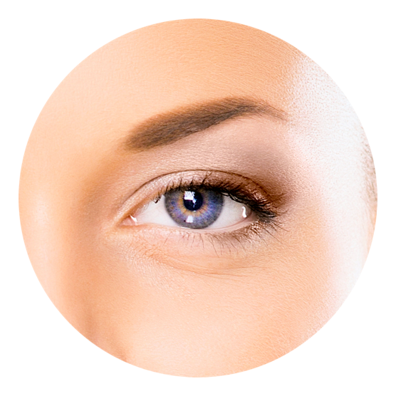
Human Eye illustration by salam6490 courtesy FavPNG.com, free for personal use only.
I chose this illustration because it also shows the texture of the skin quite clearly- study it closely!
The eyes (and the ears) is often as complicated as the rest of the skin. Hands are easy by comparison! It’s so easy to make the eye too elongated (too feminine), to get the angles wrong, or to make the person look cross-eyed. Take extra care!
On Backgrounds
One of the biggest mistakes you can make is making the background too monochrome. There will be all sorts of variations and tones.
Almost as big a mistake is to have the edges too sharp – the amount of blur should match that of the black-and-white background, but that can be very hard to judge, and you have a lot of variations and options in the blur settings. Use them cautiously, then cut away the overlap with the head/body or other foreground elements, then apply one-pixel of blur.
On working scale
You’ll find life a lot easier if you use a factor of two relative to the size of the end image. 200% or 400% of the intended size tends to work well, but I will sometimes use 800% to get the eyes right, then shrink back down to the 200% or 400% scale.
Always remember what happens to the size of your brush strokes when you do this.
The Project
So the notion is to make the background look alien with color, and to give the woman Blue Skin. I’m leaning toward blue and purple for the eyes, too, but I may try some yellow in there too. So the technique for assembling the color layer will be the same as described above, but the colors will be very different.
As a guide to what I’m aiming to achieve, here’s the same eye picture simply color-shifted into blue – it’s not quite right, but it’s a good start.

Preliminaries & Initial decisions
I’m going to use the color-multiplied-by-grayscale technique until I see it isn’t working. My first step is to resize the image to 2224 pixels wide, 400% of the width of full-column images here at Campaign Mastery.
That naturally blurs the image a little, but fixing that at this stage can introduce halos that are a pain to get rid of. That’s literally the last step!
Of course, all the examples I’m going to show here have to be reduced back to 556-wide in order to fit on the page. And, of course, I use a lot of variation in zoom levels while I’m working – there are times when 1600x zoom is called for! Where it’s important to illustrate what I’m doing, I’ll do a screen capture at either 100% zoom, or at the zoom level I’m actually using.
Phase one: the background
Looking at the background, I can’t tell where the horizon is. There’s a ground area in middle- and darker-gray which slopes down from right to left through the body. On the left, there’s a lighter gray area with still-lighter texture, and there might be just a hint of that to the right – but I can’t be certain. Then there’s a lighter patch on the left, and then another light-medium patch, which ends at the character’s eye-line. Above that is a sky. I suspect that this is actually a beach scene – sand, then surf, then sky (as you go from bottom to the top), so I’ll use that thought as a guideline, at least until I have a reason to change it.
Let’s talk about the horizon line relative to the eye-height of the person in the image, just for a moment. The horizon line is always relative to the eye height of the viewer/photographer unless they are looking (or have the camera tilted) up or down. And there’s no indication of that. Which means the apparent horizon line tells you something about the height of the person being photographed – if their eye-line is below the perceived horizon, they are shorter; if above, they are taller. Which means that my color choices for the background, which will give a far more substantial clue as to where the horizon line is, will matter in the final composition.
I have three choices:
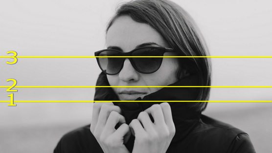
- Choice #1 uses the darker area on the right-hand-side as the indicator. This feels too extreme to me. You would expect to see the camera tilted up, even a little, and to see the underside of the nose as a result. The perspective would be all wrong – and while the image could be edited to correct the problem, that isn’t what this project is all about. Besides that, having an intersection between horizon and background right at the edge of the image is a bad composition technique – the eye tends to follow the horizon through the image of the woman and then fall off the edge of the image.
- Choice #3 feels like the ‘real’ answer, because it’s roughly 2/3 of the way up the image, and dividing into thirds is a natural (and very traditional) compositional technique.
- But choice #2 is my choice. It’s not quite 1/2 way up the image (which is another traditional compositional technique), but it’s close enough, and it implies a physically larger subject. This may require a little editing of the base grayscale image, we’ll see how it works, first. What it means is that my sky contains clouds at the horizon.
For the ground, I’m going to pick a base color of white where the dark gray is, and a grainy golden yellow where the lighter part is. For the sky, I’m going to do some swirling yellowish clouds and a green sky color.
To achieve this, I need to make that dark area a lot lighter, so I start with an addition layer. Playing around with the opacity slider, 80% look about right.
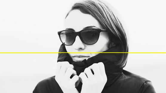
But I don’t want this for the whole image, so that means an erase layer:
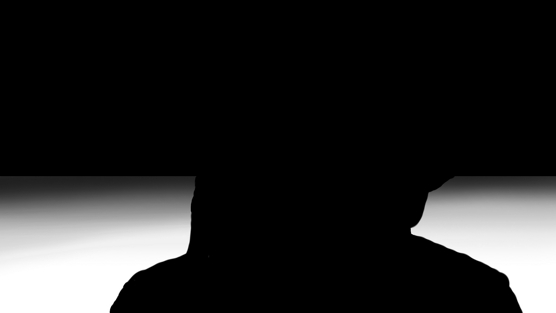
I created this layer with a square block of solid black to the horizon line, some airbrushed black to fade the effect gradually, and a couple of pens – one about 100 pixels in size and one about 30 pixels in size, both to mask out the clothes, hair, and figure.
When I combine the erase layer with the addition layer, this is all that’s left:

…and when I apply the addition to the base image, here’s what I get:
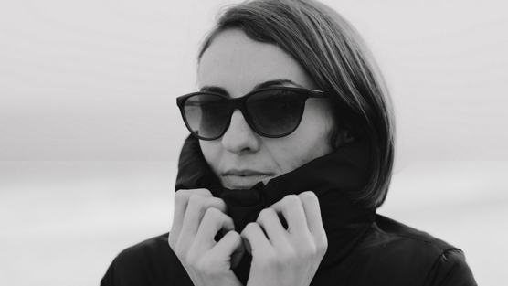
What I find most interesting about this image is that already you can see my chosen horizon line emerging. It’s faint, but it’s there, as this 100% zoom shows:

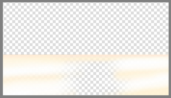
Time to start coloring! White first, and a bit of peach in the shadows, and a slightly yellower shade of the peach in between, all layered to build up a smooth transition:
Next, the water, a deep blue with horizontal dark green streaks. At the land-side edge, more streaks in a lighter blue and green with a slight left-and-right back-and-forth motion, angled slightly up. All except the initial blue were painted at 29% opacity so that the color underneath would show through fairly strongly. More angled streaks in a much lighter hue of the same color at a 70% opacity right at the bottom edge. A bit of careful almost horizontal smudge, and then some white streaks on top (with some more smudge at the complimentary angle relative to the horizon).
This close-up shows the effect the way it looked at the zoom level I used for most of the work:
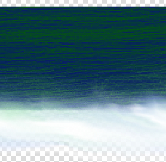
If I turn on the base image, you can see that I was not bothered with respecting the edges of the foreground figure. I’ve been careful not to go over the horizon line, but wasn’t particularly bothered with the land-sea boundary, either.

So the next step is to clean both of those up. I do that by setting the paint layer to 50% opacity (so that I can see the base image below, then erasing the bits that shouldn’t be there. I use the hard eraser over the figure, and the soft erase along the coastline, the latter at 33% opacity so that I can control the erase precisely. Finally, a very low-opacity soft erase along the coastline. I didn’t respect the boundaries in working on the land, either, so I’ll take the time to clean that up while I’m at it.
In the image below, I’ve turned on both the sea and the land layers as well as the base image..
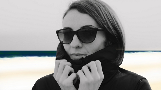
Except that everything gets lighter near the horizon, or it’s supposed to. If you don’t do that, it looks like a cartoon – and that’s not the effect I’m going for!.So I’m going to simply draw a horizontal line using the same middle and lighter greens that I used in the sea and position them at the horizon. This won’t be all that visible when the full image is reduced to fir Campaign Mastery size, but it’s there, and it matters. I’ll also do a few 20% opacity lines with the airbrush in a new layer and then fade them. Again, the effect will be subtle, but you’d notice if it wasn’t there.
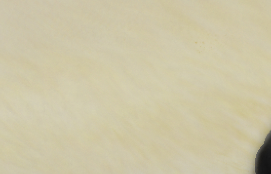
Next, it’s back to the land – using splatter thin, at about 50 pixels size, and in another new layer, I’ll add some golden yellow in various shades along the shaded parts of the land. Then, using FX_Splat_Starfield, I’ll put a little tan color underneath the speckle in still another layer. Combining them and applying a little motion blur and then some careful smudge at 70% opacity will create texture within the land.
It was while doing all of the above that I made my first mistake of the project (mistakes happen all the time). I did initial splatter effects, and the motion blur, and the smudge all on the main land layer. So I had to bring the starfield layer on top. Fortunately, it all looked good, so I didn’t have to undo or revert to a saved copy.
But that brings me to an important tip that I neglected because I was so busy explaining what it was that I was doing – save your images regularly, in the native format of whatever image editor you’re using. In the case of Krita, that’s the KRA file format. Why? Because it preserves the layer information – every other format puts the image together as though you were doing final compositing. If you’ve saved every layer, and done too much work to undo it all, the worst case scenario doesn’t have you starting from scratch – it’s deleting a layer and redoing that part of the work, nothing more.
Anyway, this view at 200% zoom shows you the texture that results, over the base image.
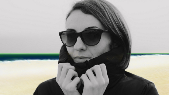
And, if I put everything I’ve done so far together over the top of the base image, here’s what it looks like:
With that, it’s time to turn my attention to the sky. Base color, a darkening fade as it gets higher, lighter near the horizon, and then some swirling clouds in another layer. This all gets done in pretty much the same way as what I’ve already shown, so let’s skip ahead to the finished product:
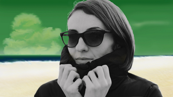
Next, I take all those color layers and merge them together into a single color layer. This step sometimes doesn’t work properly, so I’m careful to save before and after. Results are more often exactly what was wanted when the merge is done one layer at a time.
In this case, it works perfectly, so that’s good.
One reason for the merging is that it leaves me with the perfect outline of the parts of the image that are considered foreground and background, so that I can copy and paste these into separate layers that can be independently controlled.
That also lets me merge the addition layer created earlier with the grayscale background file. Because the original was very blurred, putting the grayscale atop the color layer and applying the multiply, then tweaking the opacity until it looks right – I settled on 56% – won’t make a huge amount of difference.
One final point: you’ll notice that I did NOT forget to do the part of the sky visible through the sunglasses! This sort of thing is surprisingly easy to do, it happened in the example offered in The Power Of Blur, for example.
Phase two: the skin
The first thing that I notice when comparing the photograph to the quick eye demo that I showed earlier is how gray and flat the photo in the project is, in terms of skin tone. I mean, there are some shadows, but no real highlights – at least until you look really closely. To give myself a guide to follow, the first thing I do is make a copy of the foreground layer, brighten it a bit and then apply greater contrast, especially darkening the shadows and mid-tones. This should exaggerate the tonal differences within the skin, giving me something to work from. The results are below:

That’s more like it – there are clear highlights on the hands, and on the right cheek, and even a hint of highlight on the right forehead.
With that as my painting guide, it’s time to get busy.
I outlined my process for realistic skin tones earlier. Here it is again, in list form – but remember that I want to make this lady into an obvious alien, so I’m doing the skin in blue. So I’ve put the chosen colors for this image in [square brackets] after each item on the list.
- Skin base color is peach [light blue].
- Pink texture layer on mid-tones and highlights [slightly lighter blue].
- Low opacity texture for arteries in red [dark purple].
- Low opacity texture for veins in dark blue [white].
- More peach over the edges of the highlights, faded considerably [light blue].
- Tan & Skin tone layer [darker blue again].
- Darker brown around the edges and deep shadows [very dark blue]
- Much lighter version of the same color on highlights [very light, slightly grayish blue]
- Combine everything below the artery layers into a single color layer. Combine everything above the veins into a single color layer.
- Blend those layers as necessary to get rid of any banding – smooth color transitions are the goal.
- Set the opacity of the top layer and the vein & artery layers so that these only just show through. You only want to hint at these except in unusual situations.
- When satisfied, combine skin layers into a single color layer.
A slightly grayish light brown in the same texture as the pink over the shadows [darker blue].
To this, I’m going to add a second-last step:
- Test The Multiply by Grayscale! Tweak the contrast and brightness as necessary.
So, let’s get busy.
Skin base color is peach [light blue].

Having taken a fair amount of care with this, I can then do a neat trick: using the similar color selection tool, I can restrict the working area to just the skin, even when I go to work on a new layer.
In terms of that care: having dark clothing made it a lot easier, so most of what I had to worry about was hair and the glasses. In terms of the hair, anywhere that skin might show through (including the eyebrows) was painted in the base layer. I’ll fix it with greater care when I do the hair.
Pink texture layer on mid-tones and highlights [slightly lighter blue].
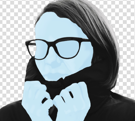
I’ve actually done two layers of highlights here, a light one and an almost white one. Even at 100% opacity, the shape of the face and hands are clearly starting to come through.
Low opacity texture for arteries in red [dark purple].
Arteries get done with the sponge texture. If you click on the paintbrush icon at the top after selecting the brush and in paint mode (the brush on the left), it opens up a panel of dozens of additional textures and settings. The texture I want is in the sixth row and is called reptile skin.
You heard me.
Here’s the result at full opacity:

But I’m nowhere near done with them yet. The next step is to apply the sharpen filter (listed under enhance). And then I’m going to use my airbrush erase at about 30% to fade these massively except in the areas around the shadowed parts of the face. And, once that’s done, I’ll drop the layer opacity down to about 8%. Finally, I’ll set the size of my erase brush to about the size of the cells of the texture and trace meandering routes through them, leaving only the ‘lightning bolt’ shapes more familiar to us as arteries. You want the blood vessels to (generally) follow the shape of the physical features like fingers.
The results are, as you can see, far more subtle.

Of course, I’ll do the same thing with the hands.
Low opacity texture for veins in dark blue [white].
I do the veins the same way as the arteries, but I reduce the opacity in the mid-tones and shadows, not the mid-tones and highlights, and I won’t drop the opacity as low – somewhere around the 30 to 35% mark is usually right.
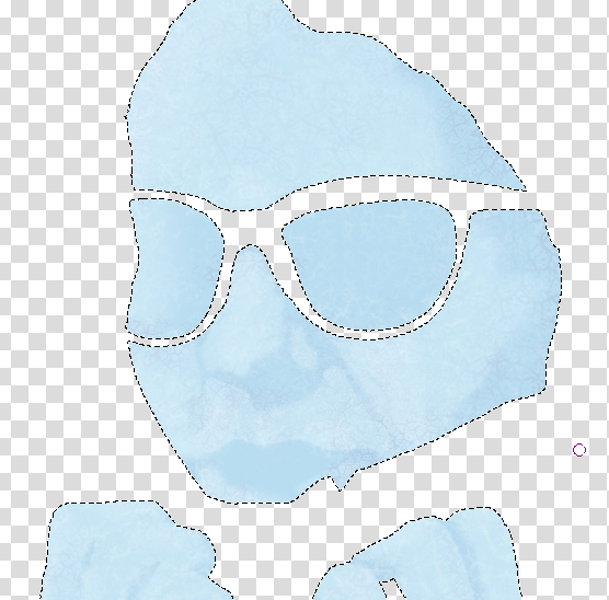
More peach over the edges of the highlights, faded considerably [light blue].
This is a job for the airbrush tool. While I can fade it using the layer opacity slider, I don’t want to make it too opaque to start with – 25% is about right, and using multiple strokes to blend. This, of course, further fades the veins and arteries.
A slightly grayish light brown in the same texture as the pink over the shadows [darker blue].
Airbrush again, starting at 70% and stepping down so as to fade the effect. This is also when I will do the lips.
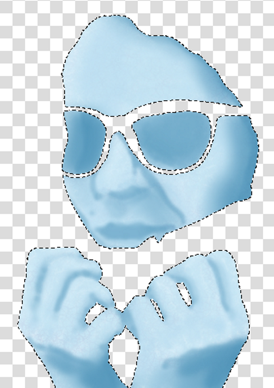
Tan & Skin tone layer [a darker blue again].
Airbrush, but at a fairly low opacity. I used 5% and 170-odd pixels.
Darker brown around the edges and deep shadows [very dark blue]
Same method as above.
Much lighter version of the same color on highlights [very light, slightly grayish blue]
And the same again.
Here’s where we’re at after doing all that:

Combine everything below the artery layers into a single color layer. Combine everything above the veins into a single color layer.
Again, no problems on this occasion.
Blend those layers as necessary to get rid of any banding – smooth color transitions are the goal.
No real problems in this regard. There usually aren’t, but this provides a last chance to find and fix any trouble.
Set the opacity of the top layer and the vein & artery layers so that these only just show through. You only want to hint at these except in unusual situations.
I ended up setting arteries to 13%, veins to 50%, and the shadows layer on top to 85%.

Test The Multiply by Grayscale! Tweak the contrast and brightness as necessary.
When I tried this with the original person image, it became just a little too dark and too flat. So I tried the version where I had enhanced the skin tones and it looks perfect:
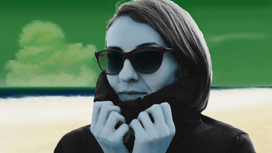
When satisfied, combine skin layers into a single color layer.
Quite satisfied, so let’s move on, having done that housekeeping!
Phase three: the hair
What color hair should this woman have? Brown? No. Red? No. Blonde/yellow? No. None of those would look right. Green? too much like the sky. Blue? Ummm -maybe. Purple? Ummm, not so sure, but maybe.
Here’s a new tip: if I place the hair color layer beneath those of the background and the skin, the only place that the effects will be visible are where there’s no color already set. So this can be done fairly quick and sloppy.
I try the blue – with a second darker shade away from the brightly-lit edge, it works.
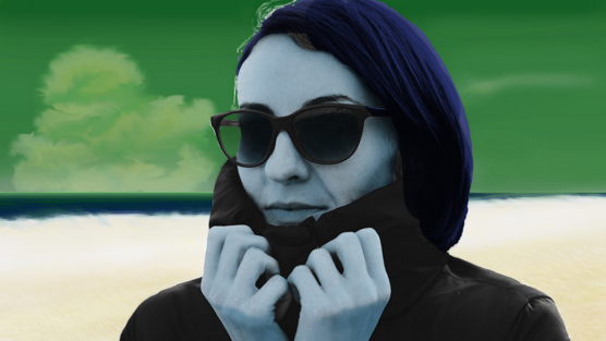
Phase four: the clothes
Clothes comprise three things in this picture: jacket, sunglasses frame, and sunglasses lenses.
I’ll do these separately.
I noted while setting the enhanced skin tones that with a little lightening, a lot more detail could be seen in the jacket. I liked the way it looked. So I’m going to start by copying and pasting just that part of the base image, and adjusting it. I will need to compensate for the comparative lack of shadows that results by adding some airbrushed darker color, but otherwise, this can be done almost as quickly and easily as the hair was.
With everything that’s not jacket removed, here’s what I end up with:
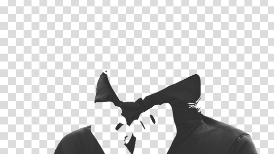
So, to colors: I think that a middle-dark red should come up very nicely. A lighter red with a little yellow tint for the edges of the jacket, and a slightly purple dark red for the shadows. Here’s how that works out:
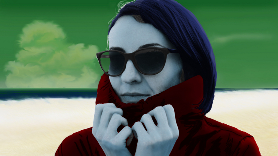
Next, the sunglasses. I don’t think there’s any need to do anything with the lenses, on reflection (not intended as a joke); the original image already darkens them. Maybe a slight color shift to the skin visible through them.
To try that, I go to my skin layer, and copy the lenses, then paste them into a new layer. But then I remembered that part of the view through the sunglasses was sky, so I turned that layer on as well, corrected my selection, and then ‘copy merged’ from the edit menu.
I darkened the color a little, desaturated it a little, and shifted the tone a little further away from yellow. It looked fine, and a definite improvement, especially after I specified “Grain Merge” compositing mode for the layer.
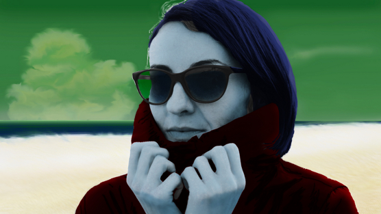
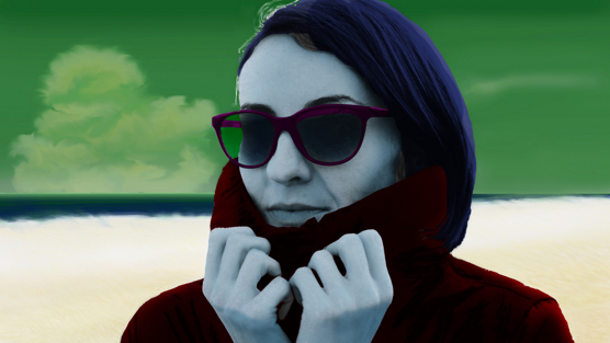
Last, there’s the sunglasses frame. For the most part, this is just black – it’s what color to do the highlights in. I think that an apple green is worth trying. Once again, I can use the “bottom of the layer stack” trick to make this a quick and easy test.
The green didn’t work, so I tried a gold. That didn’t work either, so I tried the same red that I had used in the jacket. That was closer but not quite right. A dark grape purple worked perfectly.
Phase four: final compositing
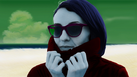
Working at x-hundred percent size means that when the final image is rendered, mistakes shrink. That’s a good thing. It also means that the final image will be a little blurred – four pixels (at 200%), or more, will suddenly become one that’s a compromise between all of them.
Step one is to make copies of all the layers and put them underneath all the visible layers, then apply Blur as described in The Power Of Blur. This fills any gaps and makes the colors look smooth. The easiest way to do this is to select the bottom-most layer, then shift-select the uppermost one, control-G to quickly put them into a group (which overrides any individual composite modes set). I can then select the group, collapse its contents list with the little downward arrow, duplicate the ‘group layer’, move the duplicate down, then quick-ungroup each group with Control-Alt-G. Foreground elements get blurred by (0.5 x scale%) pixels, background elements by (2 x scale%) pixels, and midground elements (there aren’t any in this image) by (1xscale%) pixels.
Step two is to Flatten The Image. That takes all the layers and combines them.
Step three is to resize the image to it’s final intended size. I use 1300 wide or 800 high for my in-campaign illustrations, whichever is the most constrained – 1300×650 would be acceptable, or 1100×800. That’s all about the available display space on my screen, so your choices might well be different.
For Campaign Mastery, I use two basic sizes: 390 wide or 556 wide. The latter is what all the illustrations in this post have been.
Not all of these will have visible consequences, so I won’t demonstrate them individually. Here’s the end product:
Phase five: sharpening
Time to fix that blurring problem.
I make a copy of the image and apply sharpen to the copy. This is what happens:
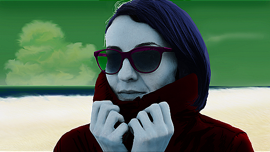
You can see the effect of sharpening. Notice the halo around the hands and at the top of the jacket collar, and the against-sky part of the sunglasses. The horizon also suddenly looks unnaturally bright – that’s another halo! And there’s one more on the shoulder to the right of the image, and yet another in the ground at the bottom of the image. Lots of halos to clear up!
The solution is to reduce the opacity of the sharpened copy until it looks right – no halos around objects, etc, but the content still sharpened a little. This is usually around the 20% opacity mark, but I’ve used everything from 40% to 10% in the past. Sometimes I’ve also had to use a low-opacity blurred copy of the image in order to soften the sharpening.
In this case, 17% looks good to me.
Once I’m happy with the end result, I again flatten the image, combining the sharpened and sharpened images. Then it’s time for a final review: is the resulting image too light? Too dark? Too much contrast, or too little? This is the last chance for any final tweaks!
In this case, I note that the lightness of the midground has accentuated a darkness of skin tone compared to the ‘quick guide’ example that I created early on, but the somewhat gloomy and mournful tone works for the image, though hinting that this is either early in the morning or at twilight. Or perhaps this is set on a world with a smaller, cooler star than our sun. I also note that the cheekbones have become even more accentuated, adding to the slightly alien physiognomy. Regardless, I’m reasonably happy with the image with no further need for tweaking.
Here’s the finished image:
Project one completed. Click on the image to open a for-use-in-an-RPG sized version.Let’s Sum Up;
There have been a number of techniques demonstrated in this article, and I’ll be referring to several of them in future parts of this series, so it’s worth taking a moment to highlight them.
- Multiply Grayscale by Color or Color by Grayscale – it matters!
- Skin (human)
- Eyes (human)
- Horizon Line significance
- Using erase to separate image elements
- Adding original image elements – constructing Sea
- Adding Texture
- Skin Color process demonstrated and adapted to alien skin
- Hair Color
- Clothing Color
- Using sharpen to correct blur from reduction in scale
That’s quite a lot for one article!
PS:
Some people may be wondering about the dashed line that appears in some of the images. That’s how Krita indicates a Mask – a dashed line that “marches” around the edge, i.e. is not a still image. Obviously, screen capture picked it up – showing absolutely that these images were grabbed “live” as I was working on the project.
PS2:
There’s been some interest in Krita itself. I find the approach very intuitive for the most part, but I’m not using the latest version (due to laziness on my part more than anything else). I’m using version 4.4.3 of the 64-bit version, pretty much as it comes out of the box (I have expanded some tool areas and added a couple of quick buttons to the top for convenience). I’ve also downloaded (but not yet installed) a whole bunch of extra brushes and textures. You can investigate further, and grab the program (free) for yourself at https://krita.org.
Next week, I’ll write on some other subject to give those who aren’t so into illustration something to think about, but then I’ll be back with Part 3, in which I’ll tackle A Blue Monkey!

Discover more from Campaign Mastery
Subscribe to get the latest posts sent to your email.
Comments Off on Image Compositing for RPGs: Project No 1