RPGs In Technicolor, Part 2
- RPGs In Technicolor, Part 1
- RPGs In Technicolor, Part 2
- RPGs In Technicolor, Part 2a: Supplemental Afterthoughts
I’m going to zip right along under the assumption that you’ve read Part 1 of this article because I don’t really have the time to recap.
Color impacts on Cognition
There have been studies that showed that exposure to the color red can impact scholastic performance by as much as 20%; other studies looking at the same alleged phenomenon have been inconclusive.
Green has been linked to a greater capacity for creative thinking.
It can be very hard separating out two contaminating factors in such studies, especially if they are broader than the simple red-or-green test that has achieved measurable results (cited above).
The first is the second-hand impact on cognition from emotional state, for which the evidence of color impact is far more strongly established. While this is likely to be less significant than any direct impact, it can enhance or subdue cognitive impacts. Purples, for example, are known to stimulate the imagination – which is great for art and writing, but not so good for other subjects like math, where they can assist the student in mental wandering and daydreaming. This is the sort of situation that I usually file under the heading of “context”.
The second is the third-hand impact of association/suggestion. Certain scents are known to stimulate cognitive function (lemon & green apple especially), while other scents are known to be calming and to suppress mental ability (lavender, for example). This means that lemon-yellow walls should remind occupants (at least somewhat) of Lemons, and that association alone has been shown to be enough to trigger the memory of the scent, and the memory has the same effect as the real thing (though perhaps attenuated). Bright green reminds people of Green apples – same story. Purple, on the other hand, is more likely to remind people of lavender, and that’s going to impair intelligence. So, once again, this factor can either undercut any primary effect, or reinforce it.
Operating at a similar intensity as this tertiary effect is a third phenomenon that I suspect exists, but which is even less studied than this whole question – the influence of secondary colors.
Most people, when they paint their walls, paint the flashing and doors and skirting boards in another color – often, but not always, white. On top of that, white ceilings make rooms seem roomier and cooler, and so are also common. And then there’s the color of the carpet or flooring – which is sometimes a monotone carpet, and sometimes something far more complex.
Humans have been decorating rooms for thousands of years – you’d think we would have a better handle on the impacts by now!
We’ve been painting for even longer – the oldest known painting is on a Spanish cave wall and was done at least 64,000 years ago.
Some rather obvious facts are known – large monotone areas minimize distractions, while isolated features of brighter color encourage focus. Too great a variety of colors tends to be confusing but the human mind has a great knack of “inventing” patterns in such situations, whether they are really there, or not. Some colors are warm and some cool – and if two colors of differing “temperature” are placed side-by-side, these values are subjectively increased if there is a strong contrast between them and a black or dark background, and pulled back towards neutral if there is no strong contrast. These principles, in theory, can be used to enhance or counter any impact on cognition, just as they are manipulated in art to make a snowy landscape feel cool and vice-versa.
But that’s about as far as color theory can take us – in fact, some of the above is not even established color theory, but are my own observations (and hence open to dispute).
According to Psychological effects of color on cognition by Timothy Makori, studies show that classrooms’ wall colors affect the attention of students in which the purple color positively correlates with the highest attention followed by blue, green, yellow and red in that order (Duyan & Unver, 2016), while the use of red or green color-exam booklets does not show any significant difference in performance in institutions of higher education (Arthur, Cho, and Munoz, 2016). However, in other experiments researchers indicated that the use of orange and yellow color-background web-based learning positively impacted on the students’ performance as they were able to complete the tasks faster than their peers with similar jobs in gray and blue website-backgrounds (Kumar et al., 2013)
Note that some of these findings are contradictory to those described earlier in the section. In part, that can be explained by another article, The Influence of Colour on Memory Performance: A Review by Mariam Adawiah Dzulkifli and Muhammad Faiz Mustafar, even though I actually accessed it to look at the impact of color on another aspect of cognition, memory.
Part of the article is a review of other potentially relevant studies, and one of them finds that color helps focus the attention of a subject (well, duh) and paying attention improves recall (likewise).
So what appears to happen is that certain colors of paint on the walls don’t attract the attention of the student, permitting a greater concentration on the lesson, and hence a better academic performance.
To be honest, there’s a lot more information in both these rather densely-packed reports than I had time to unpack, which means that closer examination should reward anyone interested in the subject.
For now, suffice it to say that science has proven a statistical connection between the color of the environment without yet being able to specify comprehensively what that effect is or how intensely thinking may be helped or hindered, beyond educated guesses – but that the impact could be significant, even profound, in at least some cases.
The use of Color in Identity
The colors of clothing choices are an essential expression of personality, especially in cases where such expressions are limited by convention.
There are some professions, for example, where the person is to be the center of attention, and these generally feature a red coat or jacket. Formal business suits are generally charcoal-gray or black, usually with a white shirt – which leaves the choice of tie as the color focus.
In many professions, there is no choice whatsoever – judges typically wear black, for example, and waiters are typically white shirts with black pants. Surgeons can wear just about anything until they have to actually perform an operation, and then they will dress in whatever scrubs are provided by their workplace – though personal (hats? caps? skullcaps? I’m not sure of the correct term) have been shown to be acceptable on some TV shows.
And, at the same time, there have been a few professions that used to be very tightly regulated in terms of what is acceptable and now have a more relaxed stance – Dentists, for example, used to wear white tops, but in more modern times, I have seen both mid-to-light blue and light green. While I’ve never seen a dentist with a fluero yellow shirt, it wouldn’t surprise me greatly were I to do so!
In other words, we are transitioning from a uniformity perspective to a functionality-plus-self-expression perspective when it comes to professional clothing – very slowly, to be sure. And the more conservative the career, the longer it will resist such change and the more slowly it will evolve stylistically as a result.
Take judges, perhaps the single most conservative establishment group. A judge might be able to get away with wearing a brooch as a point of self-expression, but in some jurisdictions not even that would be tolerated. That’s because the law is supposed to be impersonal and even-handed and just, at least that’s the ideal, and anything that suggests that a judge is a person with opinions and attitudes of their own gets in the way of them embodying that ideal.
By and large, though, when you look at society as a whole, there has been a trend for greater scope and levels of permissiveness of self-expression over the last six or seven decades. Which is another way of saying that there has been greater latitude for the use of color in clothing as a means of saying something about the wearer.
Bright colors – reds and yellows and even bright blues and greens – tend to say the most. Because they are bright, they carry an air of flamboyance, they make a personal statement. The pattern and shape of the colored apparel defines the content of that statement.
It’s possible for that statement to be quite nuanced. For example, if you see someone dressed in relatively conservative navy and white, but with a slightly-oversized gold lame bow-tie, you get a very strong indication of a particular personality – especially since bow-ties are no longer ‘in’.
Someone wearing a three-piece black suit, white shirt, black tie, and neon-pink handkerchief neatly folded with the point protruding from their breast pocket, is making a statement.
Black has an interesting duality to its nature in this regard. The ultimate expression of uniformity and conservatism, it is also the exemplar of rebellion. Compare and contrast a biker with black leather jacket and black t-shirt with one wearing the same clothing – but lime green in color. Would your reactions be the same when confronted by such individuals? I doubt it.
The right touch of color in a person’s clothing can speak volumes about who they are and what they value – or about who they want you to think they are. A banker or lawyer in a 3-piece suit is the same as any other banker or lawyer in a 3-piece suit. Add a brightly-polished gold fob-watch to the ensemble and they are visually hinting at success, with the implication that they are more trustworthy and can better help you.
One surprising side-note: the same poll (mentioned in Part 1) that identified brown as the least popular color overall found that it was the most popular color for clothing. There is a perception that brown clothing signals a lack of pretension and that such clothing lasts longer and is more practical because stains are less visible.
There is also a school of opinion out there that suggests that color choices are more aspirational than reflective – that the more conservative you are forced to be, the more likely you are to rebel with loud clothes.
This places the used-car salesman in bright check jacket on the same design continuity as a James Bond, who dresses conservatively to hide his flamboyance because it’s not really appropriate in his line of work to call attention to yourself.
A unifying perspective that I find helpful is to think of a person’s clothing choices as them trying to market who they want to be seen as. That provides a helpful tool in getting a handle on their personality and then reflecting that personality in wardrobe choices, especially color. One image mentally-conjured by a selective choice of words can be worth a thousand more words than you actually use.
Beyond Human?
Most fantasy non-humans derive from a very earth-like world, and so the colors of their environment will be very similar to our own. The cultural associations may be (should be) different, but the biological ones should at least be similar.
This is a level of detail that most GMs never get into, let’s be honest, or when they do, they tend to do something throwaway without contemplating the implications. “Elves can’t see red, it’s just dark to them, but they see more subtle shadings in blue, yellow, and green” is something I’ve seen a number of times.
I have even seen suggestions that ‘red is painful to behold’ for elves while Dwarves ‘love red, seeing shades that humans can’t’.
Another time, I saw a GM positing that Infravision and Ultravision gave species that had these abilities the capacity for seeing colors that those without couldn’t.
All of these suggestions are creditable attempts to push beyond human perceptions and at least contemplate the effects. The simplistic answer is to simple extend the perceptual spectrum into higher or lower frequencies within the spectrum, and that’s as far as most GMs go.
The first simply opens up part of the spectrum. Where humans might see 1.2 million shades of green, such non-humans see 2.4, or 3.6 – so there are subtleties of tone and color that elves distinguish between two closely-related shades that are all one color to humans. So far, so good. But then the overly-creative GM usually posits that this capacity permits two colors that look the same to humans appear starkly distinct to elves – as though an extra color was imprinted on their eyes. This goes beyond the first suggestion, treading into the territory of the fourth.
Before we follow it, let’s take a look at the second suggestion that I’ve mentioned. This does something the first doesn’t – it takes away something to compensate for the extra ability, making non-human races equal to, but not superior to, humans. “Different, not better.” It also goes a step beyond most in specifying a biological reason for the renowned antipathy between Elves and Dwarves – one is quite literally painful for the others to behold.
So far, so good. But most people have no idea what this type of change would actually look like. So let’s try to get some sort of idea, so that we all know what we’re talking about.
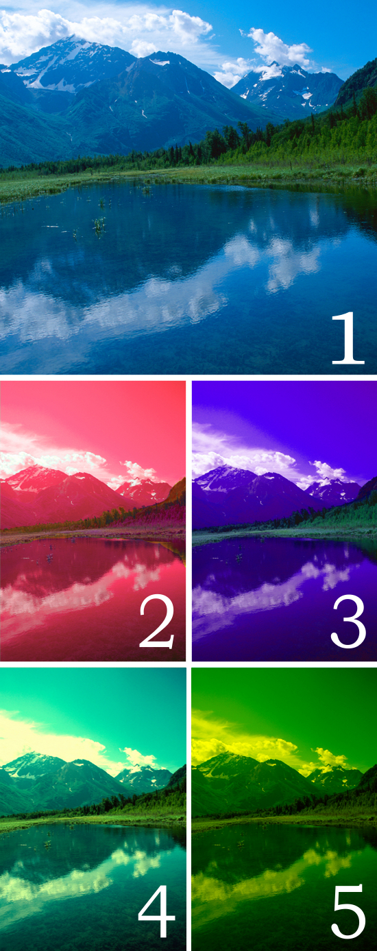
“Alaska Landscape” by U.S. Geological Survey is marked with CC0 1.0, Public domain, via Wikimedia Commons.
Image 1 is a cropped version of the original – the way you or I would see it. Image 2 is what most people imagine the image would look like if you could see infrared instead of blue-violet. Everything has shifted into the red.
On the other hand, if you saw UV instead of red, image 3 is what they imagine that would look like.
Both images 2 and 3 are wrong. Image 4 is what happens if you subtract the blue and violet from the image, then remap what remains onto a normal color spectrum. It’s not red, it’s predominantly cyan – and doesn’t look all that different to the base image, when you get right down to it.
Image 5 runs the same process in the other direction, producing a more dramatic change. If you were to tell someone who ‘saw’ colors this way that the sky was blue and the trees were green, they would be confused because there isn’t that much difference in their eyes between the two.
Not what you were expecting? I’ve also seen images like 2 used to depict ‘red shift’ – completely ignoring the fact that what was UV would shift down the spectrum into the visible light band, replacing the blue that would otherwise be lost. And the same applies in the other direction – a ‘blue shift’ would not be as obvious as many otherwise professional science fiction writers would suggest.
In fact, given how narrow the optical spectrum is, you might be hard-put to actually perceive any difference at all until the red- or blue-shift was significantly pronounced.
Trying to take this analysis any further becomes deeply frustrating very quickly, because we simply don’t know why we react in certain ways to some colors and not others. There are lots of educated guesses and assumptions – like yellow being fatiguing because it requires greater adjustments to the rods and cones of the eye, while green is restful because it requires no adjustments whatsoever – but the fact is that we don’t know why colors have the effects on us that they do. We aren’t even sure of what the effects are. How, then, can we reasonably translate those phenomena into minds of even near-humans?
Does that mean that it’s open slather for the GM to be as inventive as his capabilities permit when it comes to color and non-humans? I would suggest not. Instead, and in the absence of anything more definitive, I would suggest that the first GM was on the right track – ‘mapping’ the spectral response of a species onto a portion of the human range when psychology and biology are taken into account – even if you can’t quantify what those psychological and biological differences are.
Let’s take that “can’t see red but sees more shades of blue and green” proposal. The reddest color that would be visible would be a sort of orangish-yellow, so we label that “red” and presume that it has the same effect on elves that “red” has on us. Pure Yellow would then have the same effect on an elf that Orange has on us – daffodil merchants take note! A very greenish yellow would have the same effect as Yellow, and so on. And the missing “red” color? Well, we rarely see things as a pure tone – reflected light and reflected colors and the psychological impact of neighboring colors all come into play. So this would be a black with a strange shine or sheen.
When I’m trying to picture these color effects, I’m thinking about certain recent auto paints that change shade depending on the angle of light. I’ve seen blacks that reflected purple, and ones that reflected neon green, and ones that reflected sky blue, and several other choices to boot.
But the wilder possibilities don’t end there.
Beyond Earth?
To go further though, we need to contemplate creatures that aren’t just non-human, but are alien to us. What’s the distinction? Non-humans share our basic biology, making life simpler but a little more bland for the fantasy GM. Aliens have completely separate biology, though it might be analogous to our own. And that means that they could perceive what we describe as “Impossible colors”.
You see, the human eye takes color information that strikes it and places it onto two different color maps; this information is then synthesized in the brain into the whole spectrum of color. When one of these color maps isn’t processed properly, an individual is at least partially color-blind.
That doesn’t mean that they can’t see colors; it means that certain colors are simply shades of gray to them, or shades of aqua, or whatever. Since white is a combination of all colors, and black is the absence of them all, gray is itself a compound color; take one of the ‘base ingredients’ out and you are left with something that will inevitably look the same as a value of the color combination that the color-blind person sees – and so they label both of them gray. We don’t (and can’t) know what they are actually seeing – the presumption made is that they see gray correctly, and therefore that the statement “it looks like gray on gray” has meaning.
But we humans are a clever lot, and able to look at an objective physical reality as something separate to what we perceive with our limited senses, at least in the form of theory.
Enter the so-called “impossible colors”. Wikipedia got too technical for me on the subject, so I have relied on two more straightforward sites for this section:
- How Impossible Colors Work (And How To See Them) – Science Notes by Anne Helmenstine, and
- Impossible colors: our vision’s incomplete palette – Ness Labs by Anne-Laure le Cunff.
Impossible colors come in two flavors. First, colors that our brains construct by mixing signals, effectively hiding combinations from us – bluish-yellow and reddish-green for example. We see green and brown instead; and Second, colors that we could see if the red, blue, and green cones in our eyes biologically responded different in response to light.
The reason the human eye can’t perceive these colors is because signals from the rods (light-dark) and cones (red, green, blue) interpret signals in an antagonistic manner termed the opponent process. Scientists believe there are three opponent channels:
- Blue versus yellow
- Red versus green
- Dark versus light.
In 1983, a couple of scientists devised a test that allows some observers to see some these impossible colors. Some participants saw a new color, others saw a pattern of red and green (or blue and yellow dots), while others saw regions of one color on a background of the other color. Some of the participants who saw a new color were still able to imagine it following the test. Participants were generally unable to name the new color. Many had trouble describing what it looked like. Visit the websites listed above to try some of the tests for yourself.
When the study was repeated in 2006, it threw into question the whole concept of ‘impossible colors’. But a similar experiment that took place in between, in 2001, suggested that equal luminance was important, but the 2006 study didn’t control for this factor (and neither did the original study) – so it might be that both were flawed. The jury is still deliberating on the very existence of impossible colors, in other words.
On top of those are more definite phenomena, like Chimeral Colors – these are colors that the brain can see even though they aren’t part of the visible spectrum. Colors that fall into this category include:
- Stygian Colors, i.e. colors that are both saturated and dark. An example is Stygian blue, which appears as dark as black.
- Self-Luminous Colors appear to glow although no light is emitted. An example is self-luminous red; and
- Hyperbolic Colors, which appear more than 100% saturated. Examples include the green afterimage produced by staring at pure magenta and then looking at green leaves.
Again, check out the links above to try some of these for yourself!
There are precedents for the principle that alien species may have different biologies within their eyes – and if you change the opponent channels, you change which colors are impossible (and add our ‘impossible colors’ to the visual spectrum). Pigeons have double-cones that permit them to see into the ultraviolet and sharpen their color vision.
There would be some physical consequences to contemplate. For the eye to capture infrared, it would need to be much larger – perhaps twice the size we’re used to. Humanoids with such eyes would look more like anime characters than regular humans.
This isn’t a problem with UV; instead the problem is that UV carries so much energy. It damages human skin cells and can cause skin cancer, and it can damage the cells of the eye and cause cataracts, as well as burning the retina. No species would evolve the capacity to see into the UV spectrum without evolving some sort of defense – probably a second set of eyelids that are only opaque to UV. Again, there are biological precedents here on earth, with some species having multiple eyelids.
Alternatively, these extra eyelids might function as additional thickness of lenses, meaning that it might take a conscious act of will to see into the UV spectrum, and that it would be painful (like looking too closely at a bright light) to attempt at inappropriate times.
Either form of nictating membrane is plausible.
Ultimately, the structure of our eyes is a compromise aimed at most efficiently processing the range of light that comprises the visual spectrum. That spectrum is as wide as it is practical to make it, and while it might be possible to shift up or down the electromagnetic spectrum by a small amount, the physics of electromagnetic radiation aren’t changed – so there would be a tendency toward convergent evolution in the design of this organ.
Of course, it’s not quite that simple. Cognition takes place within the brain, not in the eyes – and we know so little about the whys and wherefores of cerebral structure that we have no idea what alternative structures might be possible, only that any such alternative would inevitably change the processes of cognition – and that includes perception.
That’s not enough to stop us from speculating and imagining, though – as I said before, we’re a creative bunch. For example, it is quite likely that the same processing shortcuts that create optical illusions might be responsible for our capacity to represent reality with a two-dimensional image; take away one, and you take away the other. This would be a considerable hindrance to social and technological evolution until some reasonable substitute was developed – no blueprints, no abstract diagrams, no illustrations. Not until stereoscopy, anyway – but it’s arguable that this would be invented much sooner (and be far more than a curiosity).
Alternatively, it might be that by closing one eye and squinting – a trick that artists use to see broad areas of dark and light for compositional purposes – such a species could manage to make sense of diagrams or paintings. Or perhaps when nature takes away with one hand, she gives with the other – this species might be better at separating different mental processes, enabling a ‘virtual squint’. This, in theory, would also permit them to perform multiple tasks independent of each other at the same time – one eye, one hand, one task – more than compensating for the handicap to their capabilities.
Let imagination be your pilot and plausibility your handmaiden.
The Colors Of The (Real) Spectrum
This is a section that has bounced around this article, at first here and then there, and never quite fitting into the existing narrative line. And yet, it seems important to actually present it somewhere.
The diagram below summarizes the colors of the spectrum, but presents them in a way that forces people to take a slightly fresher look at them. I’ve packed as much information into it as I could without getting too technical.

For a start, even though there are wavelengths specified for the ‘pure’ colors of the spectrum, I wasn’t confident of matching those colors exactly – so I chose to actually interrupt the spectrum at those points. It would be more accurate, in other words, to describe this as a diagram of the transitions between the colors of the spectrum! This also drives home the artificiality of the designations currently in use – you could easily divide the spectrum into eight colors, or nine, or even more if you didn’t space them at uniform intervals.
Because UV waves have more energy than IR waves, I’ve chosen to show the former as white and the latter as black. Neither is strictly accurate!
The color with the narrowest bandwidth is actually cyan; it takes only a small shift to the green to make it seem more green than blue, and only a small shift to the blue to make it seem like a tone of blue and not a separate color.
There are two notable absences from the list of colors: Purple and Indigo.
Purple doesn’t actually exist – it’s a synthesis between blue and red that only happens in our heads. I would describe it as the most famous invented color of all, but I’m afraid that Indigo is an even better candidate.
Described as a slightly purplish blue so dark as to be almost black, and – as a color, and not a dye – it’s been controversial ever since Newton whipped out his first prisms. Some claimed to see an 8th color in the spectrum, others saw nothing of the sort.
The description alone should have been a clue – blue lies on the wrong side of violet. Hence indigo is somewhere between blue and violet, with a tonal value that is almost black.
The final notes worth observing from this diagram are afterthoughts that I squeezed in at the very top – I took the width of the human visible-light spectrum and shifted it first to exclude blue and violet, and then to exclude red and orange. From this, you can see that the highest spectral color visible to an Infravision candidate with the same spectral range as a human is a slightly blue version of cyan – which is, as noted, almost a blue itself, while the lowest color visible to an Ultravision candidate is a slightly orange-tinted yellow color.
Beyond Reality
Of course, as creative types, we aren’t limited to the colors of the rainbow or their infinite variations. When real life doesn’t go far enough for us, we add to it and invent whole new colors.
From Wikipedia:
- One of the earliest examples of fictional colors comes from the classic science fiction novel from 1920, A Voyage to Arcturus by David Lindsay, which mentions two new primary colors, “ulfire” and “jale”.
- The Colour Out of Space, a 1927 story by H.P. Lovecraft, is named after an otherwise unnamed color, usually not observable by humans, generated by alien entities.
- Philip K. Dick’s 1969 novel, Galactic Pot-Healer, mentions a color, “rej”.
- Terry Pratchett, in his Discworld series, describes “Octarine” [Wikipedia page], a color that can be only seen by magicians; and
- Marion Zimmer Bradley in her novel, The Colors of Space (1963), mentions “the eighth color” which is visible during FTL travel.
- Finally, “Plueragloss” is the favorite color of a character who is a natural inhabitant of the afterlife in the television show The Good Place. In the show, plueragloss is described as “the color of when a soldier comes home from war and sees his dog for the first time.”
[Links are to Amazon and may earn me a small commission, unless otherwise indicated.]
As you can see, there have been many imaginary colors through the years, though I was a little surprised that it took us until 1920 to come up with one! I also have a vague memory of Isaac Asimov and EE ‘Doc’ Smith having stories with invented colors in them, though I wasn’t able to find the references in the time available.
Contrasting Choices
I wanted to include this section because sometimes it seems very strongly relevant, and at other times, it seems almost redundant.
There are certain combinations that sometimes seem to play games with human perceptions. These can be manipulated by artists and clothing designers to achieve specific effects.
Light Vs Dark
If you have equal sized swathes of a light color and a dark color side-by-side, the dark colored swathe will appear larger than the light unless they are close together and lined up perfectly – in which case the eye will follow the outlines to estimate the relative size.
This might be the ultimate reason why dark suits and light shirts are such a predominant choice for officials and businessmen – because we are subconsciously aware of the effect, and so mentally attribute the larger dark mass of the suit to the color and not to the fact that the wearer is overweight.
A dark suit, when coupled with a light shirt, in other words, is slimming.
There are limits to this phenomenon, and if you exceed them, the brain is prone to over-correct its error, giving the impression that the individual is even more overweight than they are.
Warm Vs Cool
These colors can coexist beside each other quite comfortably if one or both have a very dark tonal value. When that’s not the case, the brain inserts a dark mental division between them that doesn’t actually exist. This is especially noticeable with sky blue on a bright red.
Earth Vs Sky
Brown and Blue are, I have been told, a fashion no-no of the highest order. But there are limits to this – I have a sand-colored t-shirt that looks just fine with blue denim jeans.
The restriction itself has always seemed somewhat odd to me, because these are the colors of earth and those of sky, and those two are part of any natural terrain.
Plant Vs Sky
Almost as problematic is Green and Blue. And yet, these are the colors of leaves (and other vegetation) and the sky, and those go together quite naturally.
It sometimes seems that brown doesn’t go with anything very readily (except itself). Perhaps it’s a good thing that there are so many varieties of color under the general umbrella of “autumn colors”!
Near Vs Far
Most people are familiar with the fact that colors fade as they become farther away, due to the increased amount of air between observer and observed. What should be equally well known, but sometimes isn’t, is that the same phenomena that colors the sky blue also shifts distant colors toward the blue.
Take another look at the unmodified Alaska Landscape photo earlier in the article, and you will see this effect on the distant mountain. So pronounced is this effect on the eastern mountain range here in Australia, accentuated by the blue-green color of Eucalyptus trees, that the range is known as “The Blue Mountains”.
If the sky is a different color, this effect will also be different. And if there is no air, the resulting brightness will wash out details from any distant point.
The Color Wheel
A color wheel is a way of arranging colors so that the relationship between them becomes definable.
So much for the really easy part.
The first color wheel was developed by Isaac Newton and featured only the primary colors of light, which – when combined – produced white. It took very little time to learn that when mixing paints, inks, and dyes, combining the same three colors produced black.
This led to the color wheel of light being described as “additive” and the color wheel of paint being “subtractive”.
Below is an image of a color wheel.
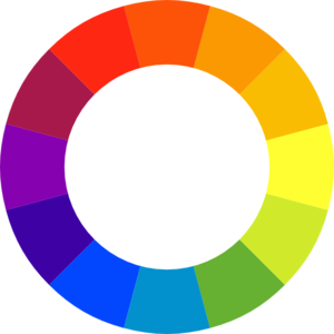
Image provided by Mohamed Ibrahim via Clker.com.
Notice that color that’s to the far left on the wheel? Most people would call that a purple. It’s not – it’s a dark violet. The color that’s technically a purple is the one just up from it that is actually a purple. And the one to the upper right of that, which looks like a very dark orange is actually a red. You heard it here first!
So much for the easy part. Now it starts to get complicated.
There have been lots of color wheels since Newton. Some have had 7 colors, some 10, some other numbers. The example wheel has twelve.
Color Spaces
There are different ways of defining color on TVs and computers, and these produce different color wheels showing how the base colors combine. The method of definition with which most readers will be familiar is the RGB (red, green, blue) model which websites use to define specific colors – roughly 64000 of them – using three values from 0 to 255. “0,0,0”.is black, and “255,255,255” is white, for example.
Another “color space” is called the HSV model. It, like a third, the HSL model, is simply a “geometric transformation” of the “RGB cube” into “cylindrical form”. Which makes perfect sense if you know what those terms mean.
RGB specifies three values that can be thought of as measurements along the sides of a 3D cube. The “RGB color space” can thus be thought of as the volume of that cube.
If you reshape the cube into a cylinder, you get different colors on the color wheel, and different colors being displayed. Early color monitors used these color spaces, with the graphics card of the computer translating RGB (and whatever else it understood) so that it would display correctly.
Other color spaces and color wheels are used for specific media, for example four-color printing. But most of these have now started to fall out of favor, with a computer doing the hard work of translating what you have into whatever your hardware needs – and increasingly, the standard in use is the RGB color space.
Tonal Factors
A number of color wheels (and paint charts) have a ring of pure color and then a number of rings in and rings out showing different tonal values of the same color, representing the combination of white or black with the base color. Unfortunately, there’s a third possibility that complicates things – combining the base color with both white and black, i.e. with gray.
Sometimes this doesn’t make a lot of difference – it just looks like a “dirty” version of the base color. Sometimes it makes a huge amount of difference – “slate blue” is blue mixed with gray, for example.
Color Schemes
Artists and designers of all types use Color Wheels to create “color schemes”. A color scheme is a selection of colors to be used in a design. Rather than a haphazard throwing together of colors that might clash or be illegible, they are designed to work together as a coordinated whole.
Color schemes can be simple, or incredibly complex. A basic color scheme uses two colors that look appealing together. More advanced color schemes involve several colors in combination, usually based around a single color; for example, text with such colors as red, yellow, orange and light blue arranged together on a black background in a magazine article.
Analogous Colors
Analogous colors work well together when used in the same way, but they don’t contrast strongly. These are colors that are right next to each other on the color wheel, like yellow and green. Yellow text on a green background? Doable – with a strong tonal difference. Without that? Hopeless.
Complimentary Colors
Complimentary colors are harder to work with; these are colors opposite each other on the color wheel. Violet and Yellow; Blue and Orange; Red and Green. Used in the same way, against the same (neutral) background, with sufficient tonal contrast to that background, they can be an effective and quite distinct choice, especially if used sparingly.
Consider a document listing various ways to react to a situation – a staff training document, say. Heading each “bad choice” with a title in red, and heading each “right choice” with a title in green, makes for a very effective mnemonic, effectively loading additional information into the document through the choice of colors.
Triadic Colors
If your color wheel divides by three the way the example one does, then you can pick every fourth color to get yourself a set of Triadic Colors. Yellow, Red, and Blue are Triadic on the example wheel.
If you know what you are doing, Triadic colors can be really powerful combinations. Blue text and Red text against a paler yellow background, for example.
I have also seen Triadic colors described as “harmonic colors”. Some of the combinations are quite eye-opening – violet, light orange, and green, for example.
It can also be said that these will usually select one warm color, one cool color, and one color that will be neutral (relative to the other two colors).
Tonal Contrast=Legibility
I’ve mentioned this a few times, but it’s worth emphasizing again – a strong tonal contrast (dark vs light) makes text legible. The closer in tone two colors are, the less distinguishable they will be from one another no matter what colors they are and the harder it will be to make out any detail.
That’s why black and white photographs work. If you ever design something – uniform, costume, web page, birthday invitation – and you find it hard to read, take a screen cap and use a paint program to desaturate the colors, and I’ll bet that you find that your choices are too close in tonal value – too close to the same shade of gray.
Campaign Mastery – an example
Campaign Mastery’s foundation color scheme is visible on every page – it’s the background, which ranges from a dark blue to a mild blue-green containing quite a lot of gray. These colors form a three-space adjacent set of colors on the color wheel. If you were to map them onto a color wheel with a full range of tonal values – essentially a color cylinder – you would find that the key values form points on a continuous, smooth, spiral. The colors used for headings (like the one below), subheadings (like the one above), and sub-subheadings are also on this spiral – with the last being as light as I can make it and still have it be legible, and the other two falling exactly at 1/3 and 2/3 of the way to black from that sub-subheading value. It’s not something that you’re likely to be consciously aware of, but this continuity plays an important role in communicating the relative importance of a heading – and the text size follows the same pattern.
When I started getting assistance from my local GMs for Ask-The-GMs, I started using another color on this range – a pale green – as background to the potted biographies that were included. This shifted the overall tone of the pages too far to the green, so I had to compensate by shifting the headings a little more to the blue.
Characterization Application
Whenever I create a character, I assign them a dominant color. This may appear as a memorable ‘splash’ in the description of the character or what they are wearing, and if that’s the case it’s the ONLY color that I will mention.
Players can assume (or not) that a character named Hiroki Fujiwara is Asian and therefore probably has yellow skin, while ‘Walking Bear’ Higgins is probably Native American and has red skin – and they might even be right! – but I usually won’t waste time saying so UNLESS this is the dominant color of the individual.
More often, the color will be an invisible ‘tint’ that will permeate the space around the character, and as such, won’t be directly mentioned at all – but it will influence my choice of language in the character’s dialogue and any other descriptions of the scene or environment.
Have you ever noticed how some people seem to carry a miasma about them, an aura that communicates and generates an emotional response? There are some people who are gloomy, and others who exude vitality and energy, and others who have an aura of mystery, and so on. Those are examples of such ‘invisible tints’ in action. Assigning such characters a ‘hidden color’ in this way gives me a shorthand reminder of how I want the character to be perceived by the players.
But this technique is more powerful than that. If I have a particular environment – cool blues, for example, or corporate grays – and I want an individual to feel like they fit in, I can use the color wheel and the principles spelt out above, to select an appropriate ‘color’ for the character and use that as the foundation of their personality, dialogue and expressions. If I want them to stand out, I can pick a complimentary color. If I want them to be at odds with the PC, I can assign the PC a probable color to match their mood at the time based on the emotional values described in part one. A straight line between that color and that of the environment, drop a line from the midpoint of that line at a right angle, and I will get a Triadic color to the combination. Shift it one around towards the environment, and you have a color that fits in with their environment and is almost certain to be exactly the type of person who will frustrate the PC when they encounter them, or interact with them in an interesting way.
Color is a tool. You can use it to shape narrative, define personalities, trigger moods, and even turn your player’s intelligences up and down a little when that seems appropriate – if you use them properly.
As readers can see below, there’s been a supplemental addition to this article. Click here to read my afterthoughts (content I meant to include but forgot)… (opens in the same tab/page)

Discover more from Campaign Mastery
Subscribe to get the latest posts sent to your email.
Comments Off on RPGs In Technicolor, Part 2


